Quantcast
Channel: MY ARCHITECTURAL MOLESKINE®
Viewing all 72 articles
Browse latest View live

FENG SHUI IN ASIAN URBANISM: KYOTO, JAPAN

$
0
0


ESPAÑOL

I think that it is fundamentally necessary for people to be able to gain an understanding of their position in the present, as a section of time between the past and the future. They can gain it from the urban environment.
Kevin Lynch

Until the eighth century capitals in Japan tended to be relocated following the emperor's death. This was a very expensive tradition, but had an important relationship with Shinto religion and its relationship with nature and landscape. When Buddhism was imported from China, a new city model, centralized, geometric and regulated by Feng Shui (or Zōfuu Tokusui, as it was locally called) took place in Japan.


Hasedera, Nara. Japanese architecture favored the relation with nature, a tradition that continued after the import of Buddism

The Japanese capitals were modeled after Chang'an , but with one important difference: the absence of walls. In that sense, the relationship between urban planning and landscape geomancy had a closer relationship.

The structure and composition of the landscape, as defined by Feng Shui principles, delineated by Saitou and compiled by Higuchi contain the following characteristics:

 1) The mountains are located the north, “like the seized head of the turtle-serpent, with undulations of the dragoon and bows of the tiger coming from the east and the west”. These mountains define a natural barrier and a space dominion that they protect.
 2) A body of water exists to the south, and the slope develops smoothly towards that direction.
 3) This configuration establishes a clear directionality according to the cardinal points and clearly is related to the solar movements, the resulting effects of light and the wind direction.


Kiyomizudera Temple, Kyoto, it is located on the eastern hills of the city.


Chang An was copied in Japan in capitals as Heijo kyo (Nara) and Heian Kyo (Kyoto), but also in cities like Naniwa, Shigaraki, Kuni.


Reconstruction of Heijo kyo, the first Japanese capital modeled after Chang'An, now in Nara.
Photo courtesy of Nara Prefecture


 Chang An was copied in Japan in capitals like Heijo kyo (Nara) and Heian kyo (Kioto), but in addition in cities like Naniwa, Shigaraki, Kuni. 


 HEIAN KYO 

Towards 794, in an area known as Yamashiro, a man was walking on a plain surrounded by mountains in the north, east and west. Between the mountains two streams flowed into a "Y" shaped junction to form a river that ran from north to south. In the south there was a large pond  (that was filled and reclaimed for urbanization in the1970s).

That man was the emperor's assistant chief of geomancy, who had been secretly sent to inspect the site along with a group of planners. This group decided that this was the ideal place to draw the new capital, as a perfect fit with the requirements of Feng Shui. I envy this man, for he saw that which is impossible to see today. He idealized the city's master plan and the relationships between the city and its environment, between man and nature.


By all means, the reasons to move the capital from its previous location in Nara were not aesthetic, but political. The great power which the priests had acquired and their physical proximity to the court of the emperor Kammu, was an important obstacle for the imperial power.


Drawing the Heian Kyo city and its main buildings 
Image by Tan Hong Yew. Source: Introduction to Japanese architecture.


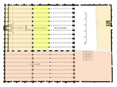
The new capital’s border was the Kamo river and was surrounded by mountains: to the north, dedicated to Genbu, the turtle black serpent; to the east, home of the one of Seiryuu, the green dragoon and to the west, dedicated to Byakko, the white tiger. To the south, there was a water body, the Ogura pool, where the bird Suzaku lived.


The protective guardians


The design of the capital was similar to that of Heijō kyō. It extended 5,5 km in north-south direction and 4,7 km in East-West direction.


Reconstruction of Heian Kyo


Urban location of the Imperial Palace


 In the north the imperial palace was located, that was a compound of 1,4 km * 1,2 km, which enclosed a series of buildings, such as the Great Hall State or Daogokuken, whose 2/3 scale replica stands on the  Heian Shrine.


Replica of the  Daigoku en, Heian Shrine, Kyoto.


In the center of the city, a huge 80 meters wide avenue called Suzaku Oji run from the Imperial Palace to the north to the enormous Rajomon Gate to the South.

Suzaku Oji Avenue and Imperial Palace


The Rajomon or Rashomon measured 32 meters wide by 8 of depth and reached a height of 9 meters. It communicated with the city through a bridge. It was a famous door, where heroes as Taira Masamori were received with pomps and honors. Nevertheless, at the end of the Heian period the district of Ukyo was deteriorated, and the porch became ruins and mulberry of malefactors and thieves, as it is portrayed in the famous film Rashomon by Akira Kurosawa (1950) .


Rashomon, Akira Kurokawa. Press here to see the movie (English subtitles)


Rashomon was destroyed and in its place there is only a memorial stone.

Place where once stood the Rashomon

To the sides of Rajomon had two major temples with their respective pagodas : the Temple of the West or Saiji and the Temple of the East or Toji . The first one is gone, but Toji still stands as the highest pagoda in Japan.

Toji Pagoda


 Heian Kyo was destroyed during the bloody wars in the Japanese middle age. The original layout of Heian Kyo is gone, buried up to 3 meters under the level of the present Kyoto. The plot of the present city is much smaller to the one of the one of Heian kyo, but it is still in general, a squared plot (different to most of Japanese cities). Also, the direction of the layout, the tradition of some streets and the natural surroundings are important references in the spatial perception of the city.


Location of Heian Kyo in the current Kyoto
Image: Wikipedia


 Feng shui or Zoufuu tokusui was later used in the construction of temples, gardens, palaces and castles, some of which have been and will be commented in this blog. Also, the visual and symbolic relation of the city with mountains has been and is an important concept in the historical development of Kyoto. Numerous temples have been consecrated to the mountains (which were attributed magical and religious properties)and still today many festivals resemble this tradition. For example,  Gozan non Okubiri is a Buddhist celebration in which great bonfires are made in form of special characters, located in slopes of hills, containing prayers for the dead. This celebration is carried out in the evening of each 16 of August, and its most symbolic element is the Daimonji, that contains the Chinese character 大 (big).

Daimonji the fire festival.
Photo courtesy of Noboru Ogata

During the rest of the year these symbols remain as silent witnesses to the pact between the city and the mountains.

Daimonji in the snow.
Photo Carlos Zeballos. 

SEE ALSO
- FENG SHUI IN TRADITIONAL ARCHITECTURE 
- ASIAN TRADITIONS

Watching the Dai Monji with my dear friends, the Perujines. We avoided the crowds from a "secret" place at the Yoshida hill. Great view, but we had to fight the mosquitoes!

CÉSAR PELLI: NATIONAL MUSEUM OF ART, OSAKA

$
0
0

* In collaboration with Ms. Oriana Nakano, Curatorial Assistant at the National Museum Osaka

The National Museum of Art (2004), designed by Cesar Pelli in Osaka, is so different from the Petronas Towers in Kuala Lumpur, that is hard to believe at first glance that this work belongs to the same architect. While the Malaysian towers stand skyward beating world records, the museum in Osaka was developed three levels underground. While the complex in Malaysia was developed based on a meticulous and strict geometry that is clearly expressed in the form and silhouette of the towers, the museum in Japan presents an explosive, amorphous facade, completely free of geometric constraints. It is possible, however, to recognize in both examples an intention to create a significant place, to establish  a landmark that will develop the collective memory of the site. In both cases, this architect from Tucuman, Argentina, has demonstrated versatility in the development of such different solutions.

Panorama showing the Museum of Art in the foreground and the Science Museum in the background.
Photo courtesy of AIA

BACKGROUND.

The World Expo'70 took place on the outskirts of Osaka, and among the facilities that were implemented for that event, the Expo Museum of Fine Arts was developed. In 1977 this building was transformed into the National Museum of Art in Osaka, dedicated to house mainly contemporary art collections.

"Tower of the Sun," by Taro Okamoto monument at the Expo Park, Osaka.
Photo courtesy of girlsmell.

In 2004 the museum was moved to the east end of the city near the coast, to a location on the Nakano island (or Nakanoshima), between the rivers Tosabori and Dojima, an area renown as Osaka's Arts District.

DEVELOPMENT

Due to limitations of the area it was decided that this 13,500 m2 complex, should be developed underground, with two galleries for permanent and temporary installations. Due to its location in an area crisscrossed by many underground streams, and given that the building would be below the level of the rivers,  triple-layered walls were built (concrete, waterproof and the inner wall of the museum), reaching a thickness of 3 meters. This armor provides the building with additional protection against moisture and earthquakes, and because of that it has earned the nickname of "submarine".

The museum is located on the island Nakano.Google Earth Image
Aerial view of the Osaka Museum of Art, next to the elliptical building of the Osaka Science Museum .
Photo Courtesy of Pelli Clarke Pelli.

The facade, however, stands as a light structure -made of stainless steel tubes coated in titanium- that emerges from the ground level, forming a sculptural spasm that exceeds 50 m. in  height, and spreading like the wings of a mystical bird. This sculpture wraps the steel and glass lobby, which affords generous natural light to the interior.

Detail of the facade.Photo C.Zeballos

Facade. Photo courtesy of Oriana Nakano.

"The steel sculpture is allowed to sway, to some extent, in all directions." says Pelli. "Given its height and location, wind and earthquake design posed unique engineering challenges. Also, many of the steel tubes must penetrate the skylight glass. For these junctures, the architects designed a watertight seal with a bellows. The bellows allow the steel tube to move 4–6 inches in any direction without breaking the glass or causing leaks. "


Photo courtesy of Oriana Nakano.
Details of the facade.Photo C.Zeballos

Next to the museum there is a bamboo garden. Both the garden and the structure are an allegory of a bamboo forest that used to grow naturally in the Nakanoshima Island before its urban development.


Some have criticized this dramatic rupture with the environment, but others have praised this synthesis between architecture and sculpture and the explicit feeling of freedom and contemporaneity expressed in its  facade. However, although this metal and glass structure bends and twists to form the building entrance, it does not transmit the flamboyant drama involving, for example, the works of Frank Gehry . On the contrary, the use of tubes instead of plates makes the whole element lighter and more transparent.  I would say that despite its apparent chaos, it is possible to perceive Pelli's orderly hand .

Inside the lobby.Photo courtesy of AIA

Entrance and lobby. Photos courtesy of Oriana Nakano

Perhaps as interesting as this external capriccio, is the spatial sensation inside this transparent lobby, a monumental space bathed in a warm and welcoming light that,  an ever-changing play of light and shadow, hits on the museum walls, coated in earthy colors.

Sections of the museum.Courtesy of Pelli Clark Pelli 

First floor, courtesy of the National Museum of Art, Osaka.

Dotted with nice details, such as a series of columns which flourish from a single point to the ceiling, the main function of this modern greenhouse is to provide natural light to the underground galleries.

Interior Details, branched columns supporting the roof.Photos C.Zeballos
Photos courtesy of Oriana Nakano


From the glazed lobby we descend through the escalators to the galleries, located below and arranged as L-shape.

The first level houses the reception, auditorium, restaurant, offices and the souvenir shop.

First basement, courtesy of the National Museum of Art, Osaka.


The double height between this level and the first basement is an ideal space to admire an impressive work by Miró (Innocent Laughter, 1969, ceramic tiles 640 pieces, 500x1200 cm, in 1977 it was received as a gift from The Commemorative Association for the Japan World Exposition’70).

Details of the double-height living room, which houses a painting by Miró and the hanging sculpture by Alexander Calder.Photo C.Zeballos

Other remarkable works on the first level are: Jiro Takamatsu’s Study for “Shadow”, Two men (1977), pencil, colored pencil on tracing paper, to be found close to the entrance of the museum shop; Henry Moore’s Large Standing Figure: Knife Edge (1961-1976), bronze, a 1977 gift from the Agency for Cultural Affairs, which is placed close to the ticket check-point; and Alexander Calder’s London (1962), painted sheet aluminum and steel rod, a work in red suspended from the ceiling.

Both second basement (B2) and third basement (B3) host temporary exhibitions – around eight each year, while exhibits from the museum’s permanent collection of nearly 6500 works, including new acquisitions, are presented on the B2 level (Collection 1: art from the 1960s (2010), Collection 2: recent acquisitions (2010), Collection 3: Japanese Art 1950-2010 (2010), Collection 4: a century of contemporary art (2011), Collection Exhibition: Japanese artists in the US (2011), Nakanoshima Collections (2011), the 35th Anniversary of the National Museum of Art, Osaka: the Allure of the Collection (2012), etc.)

Second and third basement, courtesy of the National Museum of Art, Osaka.

Profile Detail of the staircase.Photo C.Zeballos

The following pictures illustrate the exhibition "Eternity of Eternal Eternity", displaying some of the works of the famous Japanese artist Yayoi Kusama. The photos are a  courtesy of Ms. Oriana Nakano.


 "Eternity of Eternal Eternity" by Yayoi Kusama

You can see more about the work of Yayoi Kusama in our post on The Watari Museum, by Mario Botta and in this post (in Spanish)

With an exterior design inspired by the life force of the bamboo and the development of contemporary art, this new facility serves well as a space for interaction between the public and art. The Art Museum is related to the Science Museum, a building that shares with the museum an elliptical plaza. In the vicinity there is a building called Nakanoshima Mitsui Building , also designed by Cesar Pelli & Associates.

SEE ALSO:

    I would like to thank Ms. Oriana Nakano, Curatorial Assistant at the National Museum Osaka, for her kind collaboration in this post, particularly for the pictures on the Yayoi Kusama exhibition, since some installations are usually  difficult to photograph inside museums in Japan.

    WESTMINSTER PIER PARK, CANADA

    $
    0
    0

    ESPAÑOL

    New Westminster, the oldest city in the urban conglomerate that forms Metro-Vancouver in Western Canada, has recently opened a linear park on the banks of the Fraser River. The project promotes social and environmental rehabilitation and has become a catalyst for the public life and economic development of the entire surrounding area. The project has received general acclaim, wining the National Award for Sustainable Communities, the annual prize from the Federation of Canadian Municipalities of Canada and  the national Brownie Award from the Canadian Urban Institute for sustainable remediation technologies.


    BACKGROUND

    The park was built on the old pier that originated the city of New Westminster; subsequently, as in many riverfront areas in the world, it became an industrial area. Nearby, the Lytton Square was located (where a  local market was built), designed by Colonel Moody and the Royal Engineers in 1893, becoming the heart of the city.


    Before the park was constructed, the city was cut off from the riverfront. The railway divided the urban area from the abandoned industrial brownfield located by the river and a bulky three-story parking lot, built over the coastal road, blocked physical access to the riverfront. This situation made this city, once a major regional port, turn its back to the Fraser River.


    THE PROJECT

    In 2009, the New Westminster City Hall acquired a 3.8 hectares abandoned industrial area by the river, at a cost of 8 million CAD. In addition, another $25 million from the federal and central government were required for the implementation of the park.


    The 600 meters long  park is developed between Sixth and Elliot Street, and includes walking areas, playgrounds, lawns, seating areas, picnic tables, basketball courts, public art areas, services and a large parking lot.


    One of the most valued aspects of the design is its flexibility to provide different experiences to different kinds of people: those who want to run, those who want to walk, those who want to stop and look, those who want to sit or want to lie... all these activities are mixed in a cultural and allegorical framework that allows the park, in spite of its diversity, to be perceived as an integrated whole and not as a series of disjointed spaces.


    The project is the work of landscape architect Bruce Hemstock, who is also a resident of New Westminster, and who conceived the park on three themes: "The river, the past, the people".


    Hence, the park uses elements reminiscent from the past. For example, in the so-called Lytton Square within the park, a stylized pergola evokes the original market building, erected in 1893 not far from this place.


    Another recurring allegory are the piers on which the park is supported and which, at times, protrude from the surface to form "forests". There are a total of 3015 wooden poles and 176 steel pilings .


    Approximately 55% of the park area was built on water, reinforcing its  aquatic nature and its pier character.


    In addition, photographic prints on metal plates as well as a metal strip that records the most important historical events of the city, highlight the commitment of the design to be rooted in the history of the place, without loosing its contemporary character.


    The vegetation it is also an important factor in the design as it occupies 30% of the park area. In addition to the 3240 m2 of grass, several native species have been included, a gesture that evokes the Yorkville park in Toronto . There are a total of 19 tree species, 39 types of shrubs and three species of grass.


    In the short time since the opening of the park, it has become a catalyst for the surrounding areas. For example, the old facades facing the river are beginning to be recycled as terraces and restaurants open to the public and, as seen in these pictures. The positive impact will also affect the value of surrounding properties as well as the economic and social recovery of the city.


    SEE ALSO

    - Waterfront Development
    Along with our friend James Diaz

    YORKVILLE PARK, TORONTO

    $
    0
    0

    ESPAÑOL

    Yorkville is a historic neighborhood in Toronto that has become of the city's most exclusive areas, dotted with chic cafes and expensive shops, in the heart of Canada's largest city.


    Here, where renting a place can exceed $ 3,000 per sq. meter, we were surprised to find a small park  whose avant-garde, award-winning design, a project by Oleson Worland Architects represents diverse landscapes in Canada. The proposal for the Village of Yorkville Park received the award from the American Society of Landscape Architects in 1997, among others.

    Photo courtesy of Photojunky .

    ABOUT YORKVILLE

    In 1830, entrepreneur Joseph Bloor founded the town of Yorkville, one of the earliest residential suburbs  in Toronto, where houses surrounded two industries: a brick factory and a brewery. Its urban landscape, full of Victorian houses, were built precisely with those bricks, and subsequently were absorbed by the metropolis in the twentieth century.


    In the 50s a row of these houses was demolished to carry out the construction of the Bloor Danforth subway line, which later became a parking area. In the 60s Yorkville suffered physical deterioration, although  it was a social boiling point: it was the center of hippie culture and the intellectual boheme.


    From the 70's and 80's this area began its renovation by including a number of businesses located in the neighboring Bloor Street, as well as high density office buildings and condominiums began replacing the old brick houses, a tendency that continues to this day. However, a small network of alleys superimposed on the main urban layout, allowed that cultural life remained and coexisted with commercial activities. For this reason, restaurants, cafes, boutiques and art galleries also appeared in the area.

    The area is a crisscrossed by  alleys, and when weather allows, they become a public space and an expansion for cafes and restaurants.


    Parallel to Bloor Street, in a vacant lot that was used for parking until 1991, an architectural competition was proposed  in order to transform it into a park, despite the difficulty of being located over a subway line.


    LOCATION

    The Village of Yorkville Park is located on a long strip of land, running on the south side of Cumberland Street, between the popular Bloor and Yorkville Streets, and connected to several perpendicular alleys.


    PROPOSAL

    The idea for the park allowed the Village of Yorkville to recover, reinforce and extend the scale and character of the Victorian original village, while the park was linked to the existing pedestrian network. In turn, it has been a great opportunity to introduce some native plant species in the middle of a highly urban environment.


    The project was designed by Oleson Worland Architects in association with Martha Schwartz / Ken Smith / David Meyer Landscape Architects. This team proposed a series of small thematic gardens, representing the varied Canadian landscape. This collection of  gardens symbolizes the divisions that used to exist between the old houses before they were demolished.


    "We designed the park to reflect the Victorian style of collecting. In this case we were collecting landscapes of Canada – pine grove, prairie, marsh, rock outcropping and so on – and arranging them in the manner of the nineteenth century row houses"
    From left to right: wild rocky area and maples, swamp, birch, crabapples, wild flowers and pines.
    The explanation will follow the reverse order.

    Starting from the west end, there is a cluster of pines, growing around circular, donut-shaped benches.


    Interacting with this coniferous forest is a set of light poles which, aside of providing light they spread fog, which creates a particularly interesting effect at night.


    Then, in contrast to the geometric order of the pines, there is a group of wildflowers.


    It follows a garden of birch, arranged on a gravel ground. This forest is bounded by stone planters containing wild bushes.


    Subsequently we found a group of wild apple trees growing on a gravel garden, patched with pink rock slabs.


    Afterwards there is an arcade composed of a succession of metal frames, perhaps resembling the bridges or urban areas of the country. Here the floor becomes more regular, geometric, represented by a cobblestone pattern .


    Next to it there is a metal tube that supports an artificial waterfall, a thin curtain of rain that introduces the sound element to the landscape design of the park.

    The cascade freezes during Toronto's winter .Photo Courtesy of Snuffy .

    It follows a wetlands area, which is traversed by wooden bridges, crisscrossing the garden at various angles.


    Finally, flanked by a group of wild maples, there is a huge block of rock, a giant 1000 million year-old and 650 tons granite that was cut and transported in parts from Muskoka, in the so-called Canadian Shield near the Arctic, and then assembled at the park trying to minimize cracking. Given its weight, this huge rock is located on top of the structural elements of the underground.


    A contemporary element, the entrance to the Bay Station, is located at the end of the park.

    In addition on the symbolic role of this design, it is remarkable the fact that the park transmits different sensations as it is walked through, which however does not give the impression of being a collection of isolated patches but an integrated,  comprehensive proposal . Somehow it reminds me of Bernard Tschumi's thematic gardens and the promenade cinematique  for the Parc de la Villette in Paris .

    A detail of design furniture for landfill

    In addition to its aesthetic and landscape design, the park enjoy social success, since it is a meeting point for the population, often used by both businessmen and ordinary people who at times like to sit under a tree or lay down on a thousand million years stone .


    SEE ALSO
    - Parks and Landscape design


      TOYO ITO: GRIN GRIN PARK, FUKUOKA

      $
      0
      0


      ESPAÑOL

      Grin Grin Park is a pilot project designed by Toyo Ito. It is located on Island City, in Hakata Bay, north of Fukuoka, Kyushu, in South West Japan. In this exciting and innovative project, conceived between 2002-03 and built between 2004-05, Ito combined the site and the building design by means of a multidimensional walk-through experience.


      ISLAND CITY 

      The city of Fukuoka is located in a prime position in East and South East Asia, given its proximity to major urban centers like Busan in Korea and Shanghai in China as well as connections to Taiwan, the Philippines, Vietnam and Singapore.
      Island City is an artificial island located northeast of Fukuoka, in order to reinforce the functions of the port, create a whole new industry, improve the traffic system east of Fukuoka and in turn create a comfortable urban space to house a pleasant residential environment.


      GRIN GRIN PARK

      Amid Island City is a park surrounding a bean-shaped pond. It is noteworthy that the location of the park is not directly on the waterfront but  landlocked, a decision perhaps influenced by the cold winds that blow over Fukuoka in winter .


      The park has three areas: the pond, around which other elements are organized, the greenhouse, located west and that somehow protects against the sea breeze, and the other amenities that surround the pond, such as playgrounds , promenades, etc.


      As we approach the greenhouse, the unique urban furniture indicates that we are standing in a special place. The play grounds, the restrooms and even the seats have sculptural forms in addition to their function.


      Not all of them are successful, though, such as these circular seats that remain empty because they are very uncomfortable and do not favor any activity.


      However the most striking structure at the Grin Grin Park is the greenhouse. Ito's project aims to integrate architecture to the park's landscape. From the pond, the architecture seems to blend with the site, generating a topography that  is a combination of the natural and built, perhaps an analogy to the mountainous character of the country.

      Photo courtesy of K Ooni

      Another architect, Emilio Ambasz, has a proposal not far from here that shares the idea embedding a building in a construction, using terraces to vertically extend a park along a building, the ACROS Fukuoka International Hall. However, Ito's proposal goes further by providing a kinetics experience in the visitor, modelling the park on the basis of the topological relationships generated on its surface. In any case, the visit evoked me the experience of walking though  FOA 's Passenger Terminal in Yokohama  rather than that of Ambasz's proposal .

      Working in partnership with Sekkei Sougo Kenkyujo, Ito chose the image of circles (waves) radiating from the Central Park to the whole island, as the basis of his proposal. The enormous circles became craters and mounds to cover various human activities and to produce incremental topological changes to the Central Park. Therefore the architecture is shown throughout undulating sequences in spiral, integrating itself with the undulations of the ground rather than standing out as an architectural object.

      In this conceptual model the genesis idea can be seen: a ribbon is twisted twice generating spaces illuminated by three elliptical skylights.


      The architecture has a covered an area of approximately 5,000 m2, and it is a central facility located in the park. There are 3 spaces prepared around the gardens with flowers and plants, each with an area of 900 to 1000 m2.


      It is interesting to observe how the architect uses the building to define the boundary of the park, but at the same time he makes it quite permeable, being possible to walk through it, climb it, see through it or enter inside.


      These three spaces are concatenated by routes that not only remain at ground level or enter inside the building, but that are elevated forming bridges and walkways and following the surface of the roof, offering various visual experiences.


      Green spaces are mixed with the built spaces in a way in which one can not only appreciate the greenery but also read books, have lunch or participate in workshops. 

      Photos courtesy of K Ooni .

      It is precisely this sequence that gives the user freedom to experience the building in various forms and from multiple points of view. Walkways offer views of the park connecting the interior and exterior, following the topography of the roof. (watch this sequence in the video tour at the end of the post).


      The concrete slab and the skylights or glass partitions switch roles as ceiling and walls, but whereas the windows ensure visual integration with the park, the skylights help to highlight the spaces grouped around the planters under the game of light.

      Photo courtesy of scarletgreen

      The skylights are controlled automatically according to the ambient temperature, allowing ventilation on hot days or being closed in case of rain or cold weather. The cantilever structure also offer protection from the summer heat. By contrast, during the winter, the tropical temperature required inside the building is controlled by heaters.


      Although it is a relatively small project, Toyo Ito takes the opportunity to highlight its theoretical concepts in relation to architecture and nature. This relationship is based on the conception of the natural world and the architecture and it had already been expressed by Ito previously in his Sendai Mediatheque , and also in the Library at the University of Tama , despite the formal difference between them. Their relationship with nature is not only poetic, but emphasizes its concern with the technology of our era.


      But this communion between architecture and nature is it based solely on sensory and phenomenological parameters? Is it the same experience to walk around the park that Grin Grin Park than to visit the  Yoro Park, "Site Reversible Destiny" by Shusaku Arakawa , for example? Certainly not, Ito set his own rules, and followed them precisely.

      The technique that enables this design is a completely unique structure, called the method of shape analysis. First, a form is chosen, whose variations are simulated on the computer so that the load of torsion, energy of tension and distortion would be minimal. Then, a structurally optimal form is obtained as an evolved form. Feedback to this process are exchanged several times between architectural and structural designs. Finally the result was an architecture with a shell of 40 cm reinforced concrete. 


      One of the most important contributions of the building (beyond its architectural achievements) is its social role, particularly regarding to  education. The collection of various exotic species of flora and fauna provide opportunities for people to expand their knowledge of science while touring an enjoyable and interesting building.

      In the following video you can see more photos of the park and the building as well as a sequence of the walk-through .


      SEE ALSO

      - OTHER WORKS BY TOYO ITO
      - THEME PARKS

      As usual, I arrived to the site late, just when they were about to close.After begging this gentleman, telling him that I came from the other side of the planet (which is technically true) just to see this building (which was not actually true), he agreed to let me in, and I accompanied  him as he was closing the facility.When I told him that I had a blog on architecture, he became very interested and very kindly photocopied me some literature, and made ​​me promise I would post about the Grin Grin.Well, it took some time but I finally fulfilled my promise.

      HAFENCITY, THE LARGE URBAN PROJECT IN HAMBURG, GERMANY

      $
      0
      0

      ESPAÑOL

      HafenCity is a vast  waterfront development and urban rehabilitation project of located in Hamburg, the largest German port and the second in Europe, after Rotterdam. In addition to revitalizing the downtown and bringing urban life near the water, this project is an important attempt to carry out sustainable design, implemented in the contemporary architecture and urban design of public spaces located in the area.


      After the fall of the Berlin Wall, Hamburg grew from a secondary port to a carry a protagonist role by controlling much of the maritime traffic from the Baltic to Germany and Central Europe.
      In this context a project was developed to revitalize an old pier on the River Elbe that had been affected during the war and was  abandoned by disuse and deterioration.


      The HafenCity project, which began in 1999, is expected to be completed by 2020, although today it is possible access some areas that have been partially completed.

      Project Area in 1944
      Project Area in 2013. See location on Google Maps


      The project, designed by the Dutch-German consortium  Kees Christiaanse / ASTOC in 1999, expanded the central area of ​​Hamburg in 40% and transformed this unused storage area. This renovation kept in some cases the building typology of brick warehouses, but preparing them to accomodate other purposes .


      Looking to combine concepts of economic, social and environmental development, HafenCity includes mixed-use areas, such as housing for 4000 people, 45,000 offices, restaurants, a university, cultural facilities, parks and public areas. However, there has been criticiscm regarding it as elitist district, given the cost of the departments that are located in this area.


      The canal area is marked by the longitudinality of the space that visually opens to the river. Our impression was that these buildings, respectively designed by architects winners of competitions, keep a human scale in relation to the pedestrians while allowing certain density in the district. The result achieved aesthetically composed yet highly efficient buildings in terms of sustainability.


      It is also notable the recovery of old brick warehouses and public buildings or offices, in a fashion that was pioneered by the project of Puerto Madero in Buenos Aires, Argentina. Some sculptural elements are references of the industrial past of the area.


      URBAN SPACE


      One of the most celebrated contributions HafenCity is its public space, designed by Spanish firm EMBT, from the well remembered architect Enric Miralles and his wife Benedetta Tagliabue . The design exploits the interface between the city and the water, establishing various levels of contact and accessibility. It is noteworthy that the Elbe river floods two or three times a year, and for that reason the design should  provide security for the people and structures.


      "Our intervention is dynamic and flexible. A changing landscape on a human scale, moving partially with the floods, bringing people nearer to the water and its moods."


      In this regard the project of EMBT was carried out in three levels:

      a) Water level:  a floating platform running longitudinally parallel to the channel that provides access to most boats while including gardening items. The zigzagging composition of this path contrasts with the marked parallelism defined by the buildings in both margins of the channel and produces  various dynamic views and sensations, a concept that is characteristic of  EMBT work.


      b) Low Promenade level: Located 4.50 m above the water, it is used mostly by pedestrians to overlook the river from a safe area. The cantilevers offer coverage and a virtual channel that emphasizes directionality, while affording open views.


      c) At the street level. Is located at 7.50 m, separating vehicular pedestrian traffic. It also includes playing areas and pedestrian promenades.


      It is also noteworthy the  detail of the furniture, a sort of sculptural pieces that have been appropriated by the users of this space

      ELBE PHILHARMONIC HALL


      Standing over the channel by way of a flagship, the  project is the most emblematic of the district and it was designed by the award-winning and Pritzker Prize Laureates Swiss architects  Herzog and De Meuron.


      The building has been built on a former warehouse located on keel-shaped plot at one end of the pier, which has been gutted inside, leaving only the facade. Given the role that it should accommodate the building, it was impossible to keep the original layout of the warehouse and instead this impressive cultural facility is being assembled, that will include three concert halls, a hotel and luxury apartments.


      The main concert hall shows an unusual arrangement of the seats, which will allow viewers to have a different listening experience and a greater proximity to the orchestra.


      From the outside, what is most striking is the facade of the building, a  skin made of special double glass containing gas in between the two layers, which allows a sophisticated thermal control inside while creating a striking texture from the outside .


      The project has not been without criticism, since a large number of postponements have increased its cost over 200 million euros. During our visit, we will told that the facility should be concluded in 2012, but probably its construction will be completed only in 2015. However, it is clear that despite these drawbacks, it will be one of the most emblematic landmarks of the city.

      MARCO POLO BUILDING AND UNILEVER-HAUS

      This dynamic sculptural tower of winding terraces contains luxury apartments overlooking the river, piled up to a height of 55 m. Its design, developed by Behnish Arkitekten, is based on an elaborate eco-design that had a low environmental impact during its construction and maintains an efficient control of its energy consumption.


      Next to it is another building designed by the same office, this time it is a predominantly horizontal volume, the headquarters of the Unilever-Haus offices. This building presents a second skin composed of a transparent film that can provide environmental protection against the strong winds blowing in the area, Inside, light enters generously and illuminates a large multi-storied lobby, crossed by  bridges in various directions, allowing to experience an open , flexible and transparent interior. This spatial conception also favors the interaction of workers inside the building.


      ***

      The scale of this large urban pilot project, its emphasis on sustainability, underpinned by a varied repertoire of high quality contemporary architecture, make HafenCity one of the biggest developments of waterfront development in Europe. Probably when it finished in the next decade it will be an important reference on sustainable urban design.

      SEE ALSO 

      - Waterfront Development

      Curious outfit of young girls in HafenCity.

      RIETVELD + KUROKAWA = VAN GOGH MUSEUM

      $
      0
      0

      ESPAÑOL

      How interesting is that in the design of the museum dedicated to the great and troubled Vincent Van Gogh, perhaps the most important Dutch painter together with Rembrandt, have converged two masters of architecture: Gerrit Rietveld, an architectural exponent Dutch movement De Stijl or Neoplasticism and the renown Japanese Kisho Kurokawa, one of the founders of the Metabolism Movementand subsequently a theoretician of the architectural movement called symbiosis. Other designers have joined them in the landscaping of external spaces.  As a result,  the Museumplein has become the largest Dutch museum complex.


      This video, with the song Vincent by Don Mclean is a tribute to Van Gogh, and shows many more works by the painter to the limited space in this post I may.

      RIETVELD and Neoplasticism


      Neoplasticism or De Stijl was a Dutch artistic movement developed between 1917 and 1931 and promoted by the artist, critic and theorist Theo Van Doesburg.De Stijl was the name of an academic publication in which Van Doesburg discussed the ideas of this movement.

      Piet Mondrian: Composition in red, yellow, blue, black and gray.

      Born in painting, Neo was based on the abstraction of all forms of orthogonal lines and planes, and all the primary colors, white and black. While Piet Mondrian (1872-1944) is the best known artist of this movement, Gerrit Rietveld (1888-1964) it was its most renown architect.

      Rietveld began as a furniture designer, and in 1917 created his famous "Red and Blue Chair", which is a three-dimensional expression of the concepts of  the Neoplasticism.


      Red and Blue Chair and Chair Zigzag two Rietveld creations

      His first and most famous work of architecture, the Schröder house, is a three-dimensional composition based on these pictorial ideas. It has been declared a UNESCO heritage site, and we will discuss about it in more depth in our next post.


      Neoplasticism had a big influence on the Bauhaus Movement and subsequently on the development of the modern movement in architecture.

      THE FIRST VAN GOGH MUSEUM


      Rietveld began designing the Van Gogh Museum from 1963 to 1964. After the architect's death in 1964, the project was completed by his disciples J. Van Dillen and J. van Tricht. The construction of this first building was concluded in 1973. Additionally, in 1999 Martien van Goor added an offices wing that allows better communication between the different blocks in the complex.


      Main facade from the street Paulus Potterstraat.
      Rear facade to the Museumplein.Note the contemporary addition.


      The volumetric composition consists of three overlapping boxes at different heights in a staggered sequence, and organized around a central courtyard. In this space, lit from above, the staircase becomes the central element.


      Photos courtesy of Jan Tito


      The entrance fromy Paulus Potterstraat Street, is stressed by a horizontal slab covering a lobby; this sort of "floating" elements is very common in Rietveld designs.


      KUROKAWA'S INTERVENTION.


      Due to a grant from the Japan Foundation, in 1999  an extension to the Rietveld's original museum was carried out. The project was commissioned ti the Japanese master Kisho Kurokawa.


      Kurokawa, who shares with Rielveld a love for geometric shapes, proposed a building based on curved lines, based on the outline of an ellipse. Kurokawa champions the concept of symbiosis, a dialogue between two different entities, each with its own personality but seeking a common goal. His proposal is thus a symbiosis between East and West, between the straight and the curved lines, between order and chaos.


      Showing humility and respect for his predecessor, Kurokawa buried 3/4 of the building, connecting it with the old museum though an underground passage, in order to minimize its visual impact on the surroundings. However, it is its peculiar titanium curved roof which first catches the visitor's eye .


      The oval volume coated in granite is cut diagonally, defining a space that is occupied by a plaza that is eventually filled with water, becoming an abstraction of a Japanese garden.


      In the straight wall of the museum stands a metallic, tilted box  that emphasizes Kurokawa's predilection for embedding pure geometric forms on flat surfaces, as he did on the National Art Center in Tokyo, which we had reviewed earlier in this moleskine.


      Inside, the light is filtered by the curved roof and it is distributed though the fiberglass walls and wooden floors.


      Photo courtesy of MorBCN
      Photo courtesy of temp13

      Two spaces are clearly legible: the double-height curve area and suspended cube, which contains the collection of Van Gogh Japanese art of Ukiyo-e, such as works by  Kitagawa Utamaro and Katsushita Hokusai .


      The plum blossom and The Courtesan (Hiroshige)

      Museumplein

      Perhaps the question we all ask while approach the museum through the spacious forecourt of the Museumplein is ... Where is the entrance to the museum? Originally, as mentioned earlier, the building used to face a street, and on its back there was another street, the Concertgebouw (Concert Hall), that joined with the Rijksmuseum, the largest art museum in the Netherlands.


      The street in front of the Concertgebouwen 1902

      Between 1996 to 1999 an intensive renovation of this area was carried out , including underground parking, a wide expanse of lawn, shops, cafes, a pool-skating rink, the relocation of green areas and a memorial to the dead women in the Holocaust. The design was conceived by the remarkable Swedish landscape architect Sven-Ingvar Andersson, who integrated these cultural functions within a public space.


      Today this is one of the busiest areas for both residents and visitors, and often holds outdoor exhibitions.


      Currently they are carrying out renovations in museums, but in a few years it is expected to become one of the main cultural centers of Europe.


      ***

      It is always noteworthy  to remember that Van Gogh greatly influenced modern art in Holland, including the De Stijl Movement, and that Vincent in turn was influenced by Japanese art, so it was Kurokawa. The world is a handkerchief.

      SEE ALSO
      - OTHER WORKS OF Kisho Kurokawa

      - ART MUSEUMS 


      With Eric, Techi  and little Rafael

      GERRIT RIETVELD: SCHRÖDER HOUSE

      $
      0
      0

      ESPAÑOL

      Dutch architect Gerrit Rielvield's masterpiece, the Schröder house (1924), stands as the most important example of Neoplasticist architecture. In 2000 UNESCO included it in the World Heritage list because it was considered  "an icon of the Modern Movement in architecture and an outstanding expression of human creative genius in its purity of ideas and concepts as developed by the De Stijl movement" and "whose radical approach to design and the use of space, occupies a seminal position in the development of architecture in the modern age.". 


      BACKGROUND
      Frits Schröder was a lawyer married to Truus Schröder, a pharmacist. They owned a building on Biltstraat Street in the quiet Dutch city of Utrecht. There Mr. Schröder allowed his wife to modify a room at will and for that purpose she commissioned the design to Gerrit Rietveld. When Mrs. Truss Schröder widowed she decided to move to a new property,  and given the successful design experience with Rietveld, she again gave him the commission of  her new house in 1924, in which she wanted to express his vision of how a woman should live in a modern and independent way. She actively participated in the design of the house and is furniture (this building is actually called  the Rietvield Schröder House) and lived there for 60 years until her death in 1984.
      Rietvield, meanwhile, used the opportunity to use the concepts of the De Stijl or Neoplasticism Movement, which was based on the abstraction of all forms into orthogonal lines and planes, and all the chromatic palette into primary colors, white and black.
      Rietvield himself rented an office in the house until 1932, and after the death of his wife in 1958 he moved to this house, until he died in 1964 at the age of 76.


      LOCATION

      The Schröder Rietvield house is located in a suburb of the city of Utretcht, in the center of Holland. This neighborhood is composed of brick neoclassical houses, to the point that when I was walking down the Hendriklaan street looking for a symbol of the Modern Movement, the conservative style  of the houses made me think that I was in the wrong place.


      The home sits at the end of the street, facing a highway that crosses perpendicularly (which certainly did not exist when the house was built, as it was constructed in the 60's. Previously there was a small forest to which  the visuals of the social area were directed). The house contrasts with its surroundings, both in form and in proportions and materials, and precisely the massiveness of the surrounding brick houses highlights the lightness and transparency of this house made of concrete, steel and glass.


      CONCEPT

      The cubic volume of the building is broken, almost dematerialized and reassembled into primary elements such as lines and planes, whose  transparency exposes its interior. Balconies, terraces and metal columns intertwine trying to emphasize the immateriality of the volume.


      The structure also frees the components of the building, separating the clearly expressing its function.


      The planes, lines and colors of the facade and interior, painted in white, black, red and yellow, evoke a Piet Mondrian composition.


      However, the greatest contribution of the house is its interior space, both for its flow and its visual connection to the outside. The house consists of two levels, linked by a central spiral staircase.


      The Rietveld house is noted for its flexibility, particularly in the second level, where the rooms can be expanded or divided by deploying panels, a concept that modern designers took from the traditional Japanese architecture . Its open plan contrasts with the closed layout of the houses of the time, composed of rigid rooms and spaces. The multiplicity of functional options was a direct contribution of Mrs. Schröder, who wanted a house that would offer different lifestyle alternatives.


      Interestingly, the private spaces are arranged on the first level, while most public ones are located on the second level.


      First level. Plant and axonometric.

      Second level. Plant and axonometric.

      Sections.

      "... We didn't avoid older styles because they were ugly, or because we couldn't reproduce them, but because our own times demanded their own form, I mean, their own manifestation. It was of course extremely difficult to achieve all this in spite of the building regulations and that's why the interior of the downstairs part of the house is somewhat traditional, I mean with fixed walls. But upstairs we simply called it and 'attic' and that's where we actually made the house we wanted."> Gerrit Rietveld.


      For this purpose Rietvield, who was initially a carpenter, installed a series of foldable panels which can divide the space into different shapes, changing the interior according to needs of area, lighting and privacy.


      The following 3D model video explains the components of the house.


      DETAILS


      The Neoplasticist style of the house is complemented in its details, in the windows and accessories, such as furniture, to the point of establishing an ongoing dialogue with the architecture that contains them.


      Red and Blue Chair and Chair Zigzag two Rietveld creations


      The Schröder house remains valid to this day due to its apparent modernity: simple volumes and rational lines that evoke a Piet Mondrian painting in three dimensions, its frank flexibility, airy transparency and fluid spaciousness have inspired numerous contemporary works.

      Note: I would like to thank architect Fredy G. Ovando for the information provided.

      SEE ALSO

      - OTHER WORKS OF GERRIT RIETVELD

      -MODERN ARCHITECTURE


        Along with Cristina, a kind and beautiful Spanish student of architecture whom I met at the house.

        ALVAAR ALTO: SAVOY RESTAURANT

        $
        0
        0

        ESPAÑOL

        Alvar Aalto, a Finnish architect sometimes called the "father of modern architecture", is renowned for the quality of its architecture, inserted within the Modernist Movement but full of warmth, superb handling of scale and the materials and respect for the surrounding context . Among his best known works are the Academic Bookstore, the Finlandia Hall,  the Finnish Pavilion for the Paris Exposition of 1937 or the City Hall of Saynastalo .

        Less known is, however, his works as interior and furniture designer. This post focuses precisely on the Savoy Restaurant in Helsinki, which still retain some of his original designs.

        View from the old terrace, before being covered with glass, for obvious climatic reasons ( Helsinki is at latitude 60)

        Opened in 1937, the Savoy is a luxury restaurant located at the top of the Industrial building, which was not designed by Aalto.


        It consists of two areas, one indoor area and the terrace overlooking the Esplanadi Park, one of the most important public spaces of Helsinki. In addition, there are some exclusive banqueting cabinets.

        Lobby at the restaurant entrance.

        Originally the restaurant interior was designed by Alvar Aalto and his wife Aino, in collaboration with textile artist Dora Jung. The construction was carried out by Artek Oy.


        Views and details of the living room

        View to the terrace
        Esplanade Park View from the terrace.

        Despite being a luxury restaurant, Aalto rejects the glitz and instead he choose simple , austere, minimalist style, creating a warm and intimate atmosphere of elegant proportions. Among the designed elements are the club chairs by Aino Aalto and the luminaires  by Alvar Aalto.

        Detail of the luminaires

        The restaurant also contains a display of the famous Savoy vase, designed in 1936, which consists of a hyperbolic curve surface which folds sinuously along two similar curvatures of different radii.


        The design, as Aalto was inspired by the Finnish Eskimos girls' breeches. In the words of Professor Jan Michl, "it represents the qualities of the quintessential Finnish design: originality, openness and aesthetic sophistication."


        The Savoy vases were placed on each table and allowed the flowers to be arranged in different ways.


        Despite its name, the vases were not made exclusively for the restaurant, but were part of a collection for Karhula and Iittala factory for  the Paris International Exposition in 1937. In fact, the shape of the vase is similar to Aalto's Finnish Pavilion built for that Expo.


        Finland Pavilion, by Alvar Aalto. Paris Exposition, 1937


        Since the first vases were made using wooden molds, their surfaces were slightly more textured than they are today. A curious fact is that originally, after the glass hardened, the wooden mold was burned in order to release the vase.

        Currently the Savoy vase rights have been acquired by the restaurant, and it is now called Aalto Vase.

        Left: detail of the floor.Right: the restaurant was so expensive that we could only afford to eat a dessert (it was such a treat!).In the background you can see the Aalto vase, still used on each table.


        SEE ALSO
        - INTERIOR DESIGN


          With Manu and Moumita, great friends and hosts with whom we ventured to explore a bit of architecture in Helsinki. 

          KOOLHAAS & OMA: SEATTLE LIBRARY

          $
          0
          0
          The Seattle Central Library -designed by Rem Koolhaas and Joshua Prince-Ramus, members of the Dutch Office of Metropolitan Architecture (OMA), in conjunction with the Seattle firm LMN Architects- is certainly one of the most influential public buildings today. Controversial, as many of the works by Koolhaas, it attracts followers and detractors; however, with more than 2 million visitors per year and the huge catalyst effect in the revitalization of the urban environment, no one questions its social success.


          Its angular and provocative style and its exposed structure forming a diamond pattern, strongly evoked some of Koolhaas' other works, such as the CCTV building in Beijing or the Casa da Musica in Porto .


          BACKGROUND

          Andrew Carnegie, the steel magnate who built libraries across the U.S. sponsored in 1906 the construction of the Seattle Carnegie Library, made in neoclassical style in a plot located on the Fourth Avenue.


          Over the years it became necessary to have an extension, so that in 1960 a 5-story building was erected in modern international style, designed by Bindon & Wright, replacing the old library. Again, the demand exceeded the capacity of the library, coupled by the scarcity of parking areas and the seismic risk, which determined the need of constructing of a new library in the late 90s.


          CONCEPTION


          Joshua Prince-Ramus highlights three key ideas in the design of the project:
          a) A hyper-rational process of design, in which rational ideas acquire an independent logic and result in images that seem irrational (at first glance the library seems product of a designer's whim rather than an analytical process).
          b) A team work in the design process, leaving aside the image of the architect-genius, but an interactive work between several members of the office.


          c) Confronting the traditional view of flexibility in modern architecture which, according to him, makes spaces more generic where almost anything can happen within them, but in practice they are filled by the most immediate need, which ends imposing itself to other activities. Instead, he proposed the "compartmentalized flexibility", which identifies a number of places that, even if an activity is prominent, it can be ensured a spectrum of multiple functions.


          OMA based its design on the idea that books are the most important source of information that people use in the library, without neglecting many other forms of technology that are available today by the user. But perhaps the most revolutionary aspect was its idea that the library should also meet social roles (something to which librarians were reluctant at first). OMA reorganized the program proposed by them in 5 platforms whose function could be predicted to be stable in the future (administration, books storage, meeting space, information and parking ). On top of each platform four open spaces were located , whose function could become more unstable.


          The conceptual model has these two types of spaces defined inside boxes, with open spaces at the top and circulation systems linking the various elements. These boxes are moved in order to make better use of natural light and enjoy views of the city. Since each of these platforms houses different functions, various areas were assigned to them. Note the similarity with the diagram of the program with the actual section of the building.

          Subsequently these compartments were covered by a "skin" of glass and metal structure providing shade or light according to the required needs.


          This was one of the things that I liked about the library, its visual integration to the surrounding urban landscape and its clear understanding of the interior spaces, that dramatizes the tension between them. Other contemporary libraries, such as the Sendai Mediatheque and the Tama Library , both designed by Toyo Ito in Japan, have also chosen  transparency and a clear integration to the environment.


          DESIGN

          The building contains 38,300 m2 of built area in 11 stories and a basement parking.

          Something that is not very evident in the pictures is that there is a pronounced topographical difference between the 4th and 5th Avenue, which can accommodate two levels.


          Especially in the front of the Fourth Avenue can be seen the imposing overhang, 14 m. long, generating a covered plaza, an effect that somehow reminded me of that square generated in front of the Peckham Library in London .


          The lowest level, to the southwest, which is accessed from the 4th Avenue, contains an auditorium, a language center and a Children's Center whose decoration aims to "be appreciated by children, although it is not condescending to them" (this allows a 11 years old child  not to feel uncomfortable by sharing the same space with a 5 years old).
          The second level corresponds to the administration and it is practically not seen by the public.
          The third level, which is reached from the 5th Avenue, is the reception area. Outside, the skin of the facade is anchored to the floor forming a sort of entrance porch.


          Upon entering the building we were welcomed by a large square bathed in light, adorned with fountains and gardens, providing a warm refuge from the cold climate in Seattle.


          The space becomes a large room where users can enjoy reading in a comfortable chair, sipping a coffee (which is a local favorite... it is not by chance that this city is the birthplace of Starbucks Coffee).


          The fourth level contains meeting areas, arranged in more organic spaces which can accommodate up to 200 people.
          The fifth floor houses the largest number of public computers, where users can get access to more specific research materials, for which there are several librarians ready to help. Spatially, it is located in the middle of the building, overlooking the square and allowing visual contact with the street and with the upper levels.


          From the sixth to the ninth level lies one of the most innovative areas of the building: the spiral of books. Contrary to the classic horizontal library, the shelves are organized in large sloped platforms, which run continuously through ramps (a "cheap parking for books," says Joshua Prince-Ramus). Reading rooms, which for reasons of function have to be horizontal, are placed staggered along the ramps.


          The tenth floor, which is the highest level that can be accessed by the public, is the reading area​​. From here stunning views of the city can be enjoyed, particularly to the Elliott Bay. Here is also a small balcony at the end of a corridor which, according to Joshua Prince-Ramus "it was designed it in order to ask my wife to marry me... and she accepted." Actually this small space is a viewpoint to appreciate the spatial richness of the building and its wrapping glass and steel skin. I think the designers created this small balcony just for us architects to enjoy this remarkable space.

          Photo courtesy of Katya Palladina

          STRUCTURAL DESIGN

          The building represented a particular challenge, as the region is prone to earthquakes and strong winds, and the shape of the building has large overhangs that give it a light appearance, but require a special structural design. The structural solution is based on a solid concrete core holding cantilever slabs (a solution also frequently applied in skyscrapers ). This solution allows to minimize the number of columns needed inside the space.


          In addition, vertical and inclined columns and trusses were created. The floors that make up the Spiral of Books and Reading Room (6-10 stories) use leaning columns in order to transfer the weight of the upper floors.


          Finally, the wrapping diamond shaped grid serves as a structural clamping element. It contains a glass coating which has a thin metal layer that allows transparent views only from the inside.


          A external steel grid is superimposed to an aluminum inner grid to hold the glass, both painted light blue. I must say, however, that the finishing is a bit rough.


          ART AND DECORATION.

          Bright orange stairs, yellow escalators, colored carpets and a light blue grid show Koolhaas' predilection for color.


          Additionally, there are works of art such as that of Ann Hamilton, who designed a 670 m2  carved wooden floor containing phrases written in 11 different languages, which suggests a "tactile experience of the book in the digital age".

          It is also fun, going down the escalator, to find some  "Talking Egg Heads" called "Braincasts", made by artist Tony Oursler.
          Outside, the Tsutakawa fountain, also called "The Power of Wisdom" was sculpted in bronze by noted local artist George Tsutakawa.


          ****

          Despite some criticism due to the way Koolhaas and OMA perceive architecture, different than traditional approaches, it is clear that the library in Seattle is a social success. Our visit occurred during a week day and we found the library was full of people. I was pleased to find users of all ages and social groups (including many homeless who frequent the library on cold days).


          SEE ALSO
          - LIBRARIES

          SURREY CENTRAL LIBRARY, CANADA.

          $
          0
          0


          In recent times libraries are no longer conceived as simple facilities for storing books but they also fulfill a social role, enhancing the community relations. Such is the case of the Peckham Library in London , the Sendai Mediatheque by Toyo Ito and the Seattle Central Library, a project by OMA. In this post we will discuss some features of the new Surrey Library, designed as a space for research and as well as for social interaction.


          Surrey is the second largest city in the Metro Vancouver conglomerate. With its 460,000 inhabitants, it has been long overdue in its economic development. However, this situation is trying to be reversed through the development of mega-projects that seek to revitalize the downtown area as well as improve the quality of life of its inhabitants.


          The flagship of this development is the new Surrey City Centre Library, designed by Bing Thom Architects, who a decade ago had already carried out another successful project in the vicinity, named Central City, a vibrant mix use facility that combines public space, a university and a shopping center.


          The library has an iconic profile and its sloping walls express the dynamism which also characterizes the interior space. Capitalizing on the complicated geometry of the plot, this building of sloping walls, pronounced keel and large bluish windows resembles a ship.

          Photo courtesy of eVolo

          "The building design evolved out of the need to provide a space for reading, studying, and above all, gathering as a community"


          But how to understand a library function nowadays? Given the versatility of today's electronic media, the book as an object is giving up its importance as the core element of the library. By contrast, the books now share their protagonism with their readers, who also establish communication and carry out discussions between them.


          For this reason the building includes, aside of  100,000 volumes, several areas for assembly of up to 120 people, a learning center, collective and individual  reading areas, computer classrooms, a  meditation room, a teen room and children's play areas. In addition, the spaces are flexibly organized and they successfully have housed social events for the community.

          Basement and first level
          Second and third level
          Fourth level and roof plan.


          Sections. Images courtesy of Bing Thom Architects.

          This idea has led to conceive the library on the basis of two types of interrelated spaces: the more public areas, which form a large plaza, amphitheater and terraces where the community can socialize and interact; and those more private ones, containing collections of books and more intimate spaces for research and study.


          This duality of spaces is further characterized by the type of lighting. The large central courtyard is lit by large windows which establish an open dialogue with the outside. The terraces and parapets incorporate dynamism into space and promote, at the same time, visual integration between the various levels of the library.


          A small amphitheater accompanying the stair was finished in simple materials such as exposed concrete and wood. This space brings together the community to medium-sized social activities, or functions  just a place to sit and read together.


          Views and detail of the amphitheater, which brings together the community for social activities

          This space is crowned by a  trapezoidal skylight. Interestingly, it is not a typical open skylight, but rather a sort of ring around a trapeze, which allows a diffuse control of natural lighting. This detail provides technical and structural challenges, in order to sustain this great trapeze that seems to be floating, surrounded by a transparent aura.


          Another challenge was the construction of the walls, which describe a curved path while being inclined outwards, thus expressing dynamism as well as providing shadow outside.


          Despite its complexity, a computerized study allowed efficiently calculate the structure. Also, by means of  a special type of concrete a fine finish was achieved, without the need of coating. These features have allowed the library to qualify as LEED "green" building.


          The designers involved the community not only as the final users of the building but as actors that participated in the design process, through the use of social networks and collective workshops. The architects have even teamed up with high school students in order to create and discuss some of the furniture inside.


          The library is part of a larger urban area that is currently under construction and we hope to share with you in the future when finished.

          SEE ALSO 
          - LIBRARIES 

            THE LOUVRE MUSEUM, PARIS (I)

            $
            0
            0
            Photo courtesy of Olivier Ffrench
            ESPAÑOL

            The Louvre Museum or Grand Louvre is the most famous museum in the world. Its collection includes some of the most important pre-Impressionist art, which are housed in a majestic baroque palace. Its history is bursting with pageantry, stained in blood and forged in fire.

            For the reader's convenience, I have divided this article into two parts. The first is devoted to the history of the Palais du Louvre and its role regarding the Paris urban layout. The next post will focus on the famous and controversial renovation designed by the great architect Chinese-American I.M. Pei.


            LOCATION

            The Louvre complex is located on the banks of the Seine River, northwest of the Île de la Cité (Island of the city, where the Church of Notre-Dame is located).


            Extending over 40 hectares, the complex of palaces and gardens forms three large squares. The interior, called Cour Carree ("Plaza Square"), was completed by Napoleon I and is defined by four pavilions: the Arts, Sully (or Clock Pavilion), Marengo.


            In the middle, there is the Cour du Carrousel, flanked by the Richelieu and Denon pavilions. Culminates precisely in a roundabout or "carousel" in front of which stands the Arc du Carrousel and a street, the Place du Carrousel.

            The largest and external plaza, to the west, in a slightly trapezoidal shape, called Cour Napoleon, is flanked by the Hall of Flowers and the Marsan Pavilion . Both squares, Carrousel and Napoleon, were culminated by Napoleon III. The complex finishes in the Tuileries Gardens.


            EVOLUTION
            The Louvre complex was built over many centuries, his style was changing from Romanesque to Renaissance and then the Baroque, and the result not only expresses his stylistic evolution but also its changing role in the urban structure of the French capital.

            Evolution of the Louvre Palace.The original fortress of Philip Augustus occupies a small orange square.Later part of it was demolished to create the Cour Carree.

            Beginnings

            "Louvre" comes from the frank word "leovar", meaning fortress or fortified palace (what in French is called "bastille"). Indeed, the first building in the Louvre was a fortress made by King Philip II of France (Philip Augustus) in 1190-1202, located beside the River Seine in the outskirts of the city of Paris. The city at that time was walled, with its center on the island where now stands the Cathedral of Notre-Dame, and the fortress was located in the end of the town to protect it against possible invasions from the north.


            It was built on an area of ​​78 m x 72 m, surrounded by a moat and protected by a wall with bastions at the corners. Its walls had small openings and it was accessed by two doors flanked by two towers, to the south and west.


            Inside there was a large courtyard, in the middle of which stood one central cylindrical tower 15 m in diameter and 30 m high. It housed an armory, dungeons and a few real treasures.

            Foundations of the old Louvre can still be appreciated in a special exhibition at the museum.

            Centuries later, the fort began to house residential functions. King Charles V converted the fortress into a royal residence and decorated with private artworks.

            Model existing in the basement of the Louvre.

            Expansions

            Subsequent monarchs expanded the palace. Some of the most important additions were the Water Front Gallery (Galerie du Bord de l'Eau) Caterina de Medici, which extends facing the Seine (1564-80).

            Water font Gallery in the late sixteenth
            Water Front Gallery today

            In addition, in 1564 the Tuileries Palace was built (actually it was the site where tiles were made​​, outside the city), located 500 meters west of the Louvre, perpendicular to the Seine.


            Philibert Delorme was in charge of the construction of the palace, replaced in 1570 by Jean Bullant.

            Photography of the Tuileries, before its destruction.

            On one side was the Jardin des Tuileries which, unlike the Palace, still exists today.


            Later, in 1595 Henry IV, the great king who made ​​Paris a great European capital, connected the gallery with the Tuileries Palace by the Grand Galerie. This long gallery covering the distance between the two palaces was used by the aristocrats to exercise, who enjoyed to walk while observing art.


            Tuileries Palace in 1615.Note that it was not spatially linked to the Louvre, but separated from it by a wall.

            Some of the innovations in the design of the gallery included the use of glazed skylights that flooded the space with light, as well as the use of parquet floors.


            Louis XIII decided to expand the Louvre itself, demolishing part of the original palace and the ancient Clock Pavilion (Pavillon de l'Horlog). From 1658 to 1670 Louis XIV built  the Cour Carree, which is a large courtyard surrounded by buildings.

            Detail.Photo courtesy of David Bank

            However, such a complex was not enough for the royalty, and in 1670 Louis XIV (the so-called the Sun King) and his entourage left the Louvre to live in the magnificent palace of Versailles. The Louvre would become then an art gallery, opera house, theater and house other artistic activities.

            Public Museum


            Before the French Revolution in 1789, the Louvre could be seen only by members of the aristocracy, the clergy and some selected artists. When, stunned and open-mouthed, I was walking through the galleries of the museum, those magnificent halls crammed full of ornamentation and exquisite works, I imagined the feeling of astonishment and glare of revolutionaries when they first entering the palace complex. In 1793 the palace became the first major museum open to the general public, showing works of art belonging to the monarchy and the Church, and taking the name of General Museum of Arts (Musée des Arts General). According to Professor Richard Brettell, from the University of Texas, it was the first time that an international audience could access these works of art, giving rise to "cultural tourism".

            The Louvre to the Arc de Triomphe du Carrousel, commanded by Napoleon placed there.

            Later, Napoleon extended the north wing and placed the Arc de Triomphe du Carrousel between the Louvre and the Tuileries.


            The emperor used his military campaigns to remove artistic riches of conquered countries, including Spanish, Belgian, Italian and the magnificent collection of Egyptian art that can be seen in the museum. It was precisely the Napoleonic Museum (Musée Napoleon, as it was renamed) which would become the largest museum of all time.


            Completion

            The complex was completed by Napoleon III in 1852, who demolished some old parts and culminated the enclosure of the large complex of Louvre (Napoleon III who also commissioned the Paris Opera).

            The Louvre and the Tuileries in 1857
            The Louvre and the Tuileries in 1855

            It is remarkable how, through the centuries, various monarchs made the effort to bring unity to the complex, which was finally organized around a markedly symmetrical pattern. Precisely, the fact that the galleries are arranged in a slightly oblique angle has an effect on the visual perception and perspective of the complex.

            The Louvre in 1895.Photo courtesy of Parisienne de Photographie
            The Louvre before the intervention of the I.M. Pei.The pyramid would be placed where the trees.

            Unfortunately, in 1870 the Commune revolted against the Second Empire and destroyed and burned the Tuileries Palace. Actually, apparently the mob wanted to burn the whole Louvre complex.

            The Arc de Triomphe du Carrousel seen from a destroyed Tuileries Palace.
            The Tuileries Garden from the Carousel.Painting by Siebe Johannes, between 1880-1883

            The Tuileries Palace after the fire, before being turned down.

            This magnificent palace was never rebuilt. On the contrary, was completely demolished during the Third Republic.

            German soldiers in the Louvre, during the Nazi occupation in 1940.

            URBANISM

            As mentioned, in the Louvre was originally outside the city wall and had the role to protect the head of the river Seine.

            Paris in 1550.The Louvre is located in the bottom, center.

            Napoleon linked the museum to the west of the city by the Rue de Rivoli, a street that comes adorned with statues on the north side of the Louvre.


            The Louvre is the beginning of a great urban axis, which starting from the museum connects the Tuileries, the Place de la Concorde, the Champs Elysees and the Arc de Triomphe.


            During the renovation of Paris by Baron Haussmann, streets were widened not only with the aesthetic purpose to expand the vistas and visually connect the monuments, but to facilitate the movement of troops in case of riots. Connecting the Louvre Museum with the city had a symbolic meaning: the Louvre was for the people.


            Later that axis was continue until the La Défense district under François Mitterrand and symbolically joined the Arche de La Défense, the Arc de Triomphe and the Louvre Pyramid , which development and history I will explain in the next post.

            Until then.

            SEE ALSO

            - BAROQUE ARCHITECTURE

            Ahem ...Everywhere there is always a shameless tourist ... 

            I. M. PEI AND THE LOUVRE MUSEUM

            $
            0
            0

            This second part dedicated to the Louvre Museum is focused on its contemporary remodeling, since the first  post was devoted to the creation and evolution of the Palais du Louvre.

            The Louvre Pyramid, designed by Ieoh Ming Pei is an iconic landmark and represents the insertion of modernity in a historic setting. Controversial, hated and loved, the Louvre Pyramid has become a place where contemporary architectural landscape of Paris in the collective memory of Paris and even in literature, especially in the also controversial Da Vinci Code .


            BACKGROUND

            Following the establishment of the Third Republic in 1870, until early 1980 the Louvre Museum hosted a number of functions in addition to the museum, such as the Ministry of Finance. Moreover, the exhibition areas were separated, scattered and poorly organized, with multiple entrances that caused  chaotic circulations and lack of public services. Perhaps the worst of all was that many stored works became moldy because there was no room to display them properly.

            The Cour Napoleon before the intervention.

            Since 1981 François Mitterrand proposed to return to Paris its prior character of world's cultural capital. For this purpose Mitterrand (nicknamed Mitte-Ramses II for his tendency to make monumental works), promoted a renewal that Paris had not seen since the times of Baron Haussmann, including such important works as the Parc de la Villette , the City of Music , the Arab World Institute , the Arch of Defense, the National Library, the Centre Pompidou and the remodeling of the Louvre Museum among others.

            In order to integrate the Louvre in a  comprehensive and logical way, in 1983 Mitterrand hired the Chinese American architect I.M. Pei, who had just completed his National Gallery Washington (I hope to review this great project in this blog in the near future).


            There was no contest. It is surprising that a socialist French president chose an "imperialist American" architect to remodel one of the most emblematic buildings of French architecture. Maybe that's why Pei was not very enthusiastic to accept the undertaking at first.

            Pei's First schemes on the Louvre
            "I told the president that I considered it a great honor, but I could not accept the job immediately. I asked him if he would give me four months to think about it -I had already decided I wanted to do this, but I wanted to see if it would possible to do it" recalled Pei with his characteristic simplicity.

            After several secret visits to the Louvre, Pei met Mitterrand and convinced him that the only way to achieve an efficient functional relation between the many buildings of the museum had to be through an underground connection, assuming the Cour Napoleon as the center of gravity of the Louvre. Mitterrand was a avant-garde politician and accepted not only the underground intervention , but the intrepid proposal to place a glass pyramid at the entrance of the museum.

            Aware that the architect's proposal would bring criticism from his conservative fellows, Mitterrand and Pei worked in  the project almost secretly, and when they had to start the construction, the protests were immediate. About 90% of the population of Paris (known for its anti-Americanism) was against the proposal as a century before the Parisians had opposed the Eiffel Tower. There was even an angry French woman who spat on the architect Pei . "How can you destroy the Cour Napoleon, one of the most important urban spaces not of France, but of the world?" cried the critics. Actually, that space was being used as a parking lot by the Ministry of Finance during the day and as a refuge for drug addicts at night.


            "The pyramid was a very controversial subject, back in 1984-85, as people tend to confuse the form of the pyramid of the Louvre with that in Egypt. I think it is not accurate: the Egyptian pyramid is huge, it is made of solid stone,and it  is a place for the dead. The pyramid at the Louvre is the opposite: it is made of glass, it is transparent, and it is for the living. "

            Construction of the pyramid

            However, upon completion, the work was praised for his severity, functionality and clarity, as well as the architect's effort in trying to highlight the ancient work through a simple and clear geometric element. Today it is one of the main symbols of Paris.

            CONCEPT

            Pei started from the premise that, rather than that the museum was located only the south wing, a large elongated building, it should cover the whole palace complex, organizing itself in a U shape around a courtyard. Then he had the idea of ​​digging up the yard Napoleon nine meters underground and there provide enough space for the storage of the works of art and loading equipment, an auditorium for 400 people, information areas, conference centers, a friendly cafe, book stores and souvenir shops.


            The entrance to the museum is the symbolic center around which the three pavilions of the museum are organized .


            This humble gesture of digging its architecture to make it less shocking is recurring in Pei, as we saw in the Miho Museum, which we reviewed earlier in this moleskine.

            Pei organized the museum in a logical way, placing the works from northern Europe (France, Germany, Netherlands) to the north, and the ones from southern Europe (Italy, Spain, Egypt) in the south pavilions.


            The entry should have an appropriate scale. However, he refused to build a solid element that would compete with the presence of the baroque buildings. By contrast, he chose a very discreteelement  in comparison with the enormous remodeling that was carried out underground.


            "I think the transparency of the pyramid is very important here. Not only to bring light into the reception room, but also to see the entire complex of the Louvre through it."
            The Clock Pavilion (Pavillon de l'Horlog) seen from outside and inside the pyramid.

            The 21.6 m high pyramid is based on a metal space frame, which holds  672 glass panels that define the grand access, bathed in light and a spacious and imposing space.


            But why a pyramid, of all shapes Pei could have chosen?
            "Formally, the pyramid is the more compatible figure with the Louvre's architecture. Also, it is one of the most stable forms, ensuring  its transparency ... and it is constructed of steel and metal, symbolizing a break with past traditions, it is work of our time. "


            As an enthusiast for geometry, and emphasizing the symmetrical pattern of the palace, Pei transformed the old parking lot on the Cour Napoleon into a square with  triangular fountains around the pyramid and three small 5 m high pyramids, located at the north, east and south.


            Inside, the light bathes the wide, marble-tone soft and warm spaces, elegantly housing the artwork without trying to impose to it, as he did in his Miho Museum.

            Detail of spiral staircase, a sculptural element into the museum.

            Urbanely, Pei's contribution to Paris was to turn an obstacle in the circulation (as the museum previously behaved) into an important node and a bridge connecting the districts on the left bank of the Seine.
            "To the north you can go to the Rue du Rivoli and the underground. Heading west you can go to the gardens and two large staircases lead you out, to the gardens ... The Louvre is open to the entire public. They do not need enter the Louvre ... they were not used to walk by the Cour Napoleon, but now they do. "


            SECOND PHASE

            The Louvre opened its doors in 1989, and gradually the criticism became praise. That confidence led Pei to more freely develop the second phase of the renovation in 1993, including the Richelieu wing, formerly occupied by the offices of the Ministry of Finance.

            Renewal of the pyramid side wings

            It was an internal architectural renovation maintaining the historical shell. For this purpose the interior and exterior facades of the museum were restored and defined 3 patios (which previously were also parking areas) and  glass-roofed internal galleries.


            Except for some historic rooms, the offices of the ministry (which were crowded up to 6 levels) were completely remodeled to accommodate three levels, consistent with the external proportions: the lower level for sculpture, decorative arts in the second level and paintings the top level, for which skylights were installed to allow their best contemplation.


            It also included a shopping center beneath the Arc du Carrousel and the famous Pyramide Inversée, was installed, an inverted pyramid that brings light to the interior while dramatically hanging just inches from a smaller stone pyramid.


            "I thought it would be fun to make a mischievious piece, something like what the French call  a "folie "(folly) and I inverted the pyramid, creating a frivolous symbol but that does not take up space."

            THE COLLECTION

            If I had to choose 3 objects that impacted me from the very extensive collection of the Louvre, probably I would select:

            The Winged Victory of Samothrace or Niki of Samothrace.

            The Venus de Milo , which was higher than I thought.


            And the famous Gioconda, or Mona Lisa del Giocondo, by Leonardo Da Vinci, which is smaller than I thought. This video discusses the reason for his fame.

            THE DA VINCI CODE.

            About the controversy over the novel by Dan Brown and its relationship with the museum, please see my opinion in anecdotes of Moleskine (in Spanish, please use Google translator to the right).

            SEE ALSO


            OTHER WORKS OF IM PEI.

            ART MUSEUMS


            JEAN NOUVEL: LOUVRE MUSEUM, ABU DHABI

            $
            0
            0

            ESPAÑOL

            The new Louvre Museum in Abu Dhabi, designed by French architect Jean Nouvel, is the fourth major cultural facility in the Saadiyat Island. Of all these great complexes are designed by star-architects (including the Guggenheim by Frank Gehry , the Performing Arts Center by Zaha Hadid and the Maritime Museum by Tadao Ando), the Louvre Museum is, in my humble opinion, the proposal that better interpreted the genius loci and the urban characteristics, architecture and culture of the Middle East, without falling into copying vernacular forms.


            EXPANSION OF THE LOUVRE

            As mentioned above, the Louvre Museum began as a cluster of palaces that were added successively by French kings and emperors throughout centuries. Later, François Mitterrand proposed a plan to modernize the museum, following the ideas by the Chinese-American architect I. M. Pei and his famous glass pyramid. Such expansion was very controversial at the time.

            Today, the Louvre, the most famous museum in the world, has decided to follow the footsteps of the Guggenheim and benefit from its priceless collection of ancient art. Interestingly when the expansion plans of the Louvre were unveiled, there was the same opposition from the public  and many French intellectuals have declared that "museums are not for sale". Jacques Chirac, meanwhile justified the deal as a way to establish links between Western civilization and the Middle East.


            THE LOUVRE ABU DHABI

            "Devoted to exhibiting works and artifacts from the past, the Museum of Classical Art is bound to features both remote and familiar, deriving naturally from the spirit of the place. The island offers a harsh landscape, tempered by its meeting with the inlet, a striking image of the aridity of the earth versus the fluidity of the waters. These fired the imagination towards unknown cities buried deep in the sands or sunk under water. These dreamy thoughts have merged into a simple plan of an archaeological field revived as a small city, a cluster of low-rise buildings placed along a leisurely promenade."
            Jean Nouvel.

            A huge dome, a common figure in Islamic architecture although  flattened here, is located between the Guggenheim Museum and the Performing Arts Center. It is also a reference to the landscape, evoking the profile of a big dune in the desert.


            Nouvel prefers to separate it from the immediacy of the city and create an almost theatrical environment, composed of a group of buildings that have intimate contact with the water. Nouvel's idea was to create a small "lost city" almost like a ruin lost in the desert displaying its treasures.


            Interestingly,  the layout of the rooms and the spatial pattern of the museum contains somewhat the character of the urban fabric of Arab cities, recalling spaces as the souq, or a discontinuous succession of squares and buildings , creating gaps and offering multiple visual sensations to the visitors.


            The organization of this city-museum however, is not chaotic, but covered by two overlapping rotated gridirons.


            "This micro-city requires a microclimate that would give the visitor a feeling of entering a different world. The building is covered with a large dome, a form common to all civilizations. The dome is made of a web of different patterns interlaced into a translucent ceiling, which lets a diffuse, magical light come through in the best tradition of great Arabian architecture. Water is given a crucial role, both in reflecting every part of the building and acting as a psyche, and in creating, with a little help from the wind, a comfortable microclimate."

            Nouvel applies here an element which has invested several years of research on Arab culture, and is a set of overlapping frames that simulate the mashrabiyya, a latticework typical of Islamic buildings that the French architect has applied in his early Institute of the Arab World in Paris or his recent Tower in Doha, Qatar .


            My guess is that the effect of this controllable light would be almost magical, judging by the renderings, picking up the spirit of the shade under a palm oasis or the elaborate patterns of light that are experienced in the Alhambra in Granada or Cordoba Mosque.


            The experience is different when approaching the museum from the sea, and this is a link between the navigator and the land that it welcomes him-her.


            The landscaping is a microcosm of different conditions found in the region, from the oasis to the dune, from the pond to the archipelago, each layer exposing its own specific plants and enhancing the character of an “island on the island.”"


            The whole territory is envisioned not so much as a nostalgic longing for some remote world, some lost paradise, but as a trigger to question a sense of time."

            The following is a promotional video about testing the light patterns using a model of the museum.


            SEE ALSO

            - Louvre Museum.

            - Other works in Saadiyat Island.


            - Other works by Jean Nouvel.
            Jean Nouvel next to Sheik Sultan bin Tahnoon Al Nahyan testing the light effect of the Dome of the new Louvre.

            VANDUSEN VISITOR CENTRE: INTENSIVE GAZES

            $
            0
            0

            ESPAÑOL

            In a prior opportunity I had reviewed the VanDusen Botanical Garden's Visitor Center in Vancouver, during its construction process. This time we share some views of the finished work.


            The undulating surfaces receive visitors extending their arms as an organism that seems to be about to take flight. However, from a distance, particularly from the parking lot as well as from inside the garden, the building's profile topography that emulates the surrounding mountains.


            All circulations lead to central hall, stressing the centralized composition of this building which assumes a flower shape layout. The skylight, that is also evident in the facade composition, appears as focal element of the space, and is accompanied by a cylindrical moving screen that protects the lobby from excessive sunlight.

            The building, although it is the gateway to the Botanical Garden, also functions as an autonomous entity including education (library and workshops), artistic (showrooms) and commercial (a shop and a cafeteria) facilities, which are freely accessible without the need of entering the garden. However, the visual integration of the building with the garden is open and permeable.


            What is less clear is the relationship with the  visitor centre's green roof. As discussed priorly, the garden extends to the roof of the building, which not only provides a habitat for various species that live in it, but also has an effect on the climate control inside the building, especially in summer. 

            This relationship is not evident to the public directly, and in fact I had to climb on the wall to take the pictures of the roof garden shown in this post.


            The building exhibits frankly its constituent materials, primarily wood, glass and metal, as well as the so-called "concrete ground" or "eco-concrete", which although correspond to particularly differentiated formal elements such as ceiling, windows and walls, they maintain a balanced and suggestive harmony. But it is also important that you do not see, the technology used to make this a state-of-the-art sustainable building.

            DETAILS


            SEE ALSO:


            THE GREAT MOSQUE OF CORDOBA

            $
            0
            0

            ESPAÑOL

            Cordoba, Spain, is a charming town on the banks of the Guadalquivir River.A melting pot of cultures that produced its urban fabric, in its exquisite courtyards, its fused architecture and its fine art, dating back from  millennia.

            Cordoba's picturesque streets, with the tower of the cathedral in the background

            Typical Andalusian patio
            Photo courtesy of Janette Simplina

            Having been inhabited by Iberians, Phoenicians, Greeks, Carthaginians, Romans and Visigoths, the city developed largely in the Middle Ages, under the coexistence of Muslims, Jews and Christians.

            Remains of Roman temple in Cordoba
            Photo Carlos Zeballos


            It was during the Islamic rule that Cordoba became a gravitating center of Islamic culture in the area of ​​Al-Andalus, where arts, literature, philosophy, medicine, chemistry, and other activities flourished .

            Statue of Ben Maimonides, a noted philosopher, physician and theologian

            THE GREAT MOSQUE
            The most notable expression of Moorish architecture is the Great Mosque of Cordoba, whose orthogonal geometry contrasts with the intricate streets that make up the urban layout of Córdoba, and whose harmonic and rich decoration shines under a masterful play of light.

            Mosque next to the Guadalquivir.
            See location on Google Maps


            The Great Mosque is the result of many modifications and additions through the centuries.It is believed that it was originally a Roman temple, but the truth is that it was a Visigoth church, the Basilica of Saint Vicent. In 751 the Emir Abd al-Rahman I bought some area of the church to accomodate his own place of prayer (for some time Christians and Muslims share the same place of worship).Successive interventions by Abd al-Rahman II in the ninth century, Al Hakam II and Almanzor in the tenth century enhanced the mosque to the size that we know today.In the sixteenth century, Bishop Alonso Manrique turned the mosque into a cathedral.

            THE TOWER OR MINARET 

            The minaret is a tower located in a courtyard,  from which a muezzin calls Muslims to prayer. The original minaret was in the midst of the current Court of the Oranges and was built by Hixam I. When the courtyard was enlarged, the tower was destroyed and a new one was built in the tenth century The current tower, called the Cathedral, was made in the seventeenth century, practically wrapping the old minaret .

            The tower of the Cathedral from the Patio of the Na
            Photo Carlos Zeballos

            The entrance to the complex is given through the Gate of Forgiveness (Puerta del Perdón), where forgave pilgrims were publicly forgiven.

            THE COURT OF THE ORANGES

            Mosques have two parts: the sahn or courtyard that features a tower called minaret and the masjid or prayer hall. Behaving as a transition space between the space of the street and the sacred area of ​​the mosque, this court is named after its orange trees, arranged in a grid layout. This space was where the faithful wash before entering the Grand Mosque. In the middle there is a fountain that is said to concede marriage to whoever drinks from its waters.

            The Court of the oranges or sahn, a transition space before entering the temple.
            Image courtesy of CVC


            THE FIRST MOSQUE

            The original mosque, with capacity for 5,000 people, made by Abd al-Rahman I, consisted of 11 oblong naves ending in the qibla, a wall pointing towards Mecca (though this wall is oriented a little further south). This building system was based on a series of arches and columns arranged in two rows. At the bottom are located some horseshoe arches, on which are superimposed semi-circular arches. This technique could give more height to the naves while allowing transparency and spatial communication between them. This system was based on the great Roman aqueducts and in the horseshoe arches,  typical of the Visigoths, but here in Cordoba achieved a unique combination. The pillars are decorated with corbels on their front. Since, as we said, this mosque was built over a church, and many of the materials were recycled elements, it is possible to observe dissimilar capitals and columns. Its unique two-color pattern is due to the use of alternating voussoirs of brick and limestone.

            Arches of horseshoe arches
            Photo Carlos Zeballos


            THE FIRST ENLARGEMENT

            To make the first enlargement in 832, Abd al-Rahman II demolished the mosque qibla and extended it towards the river, building also, as mentioned, the first minaret. The original floor was rammed earth mixed with clay called red ocher.

            In 855 Muhammad I remodeled the San Esteban Gate, whose arc is finished with a molding called alfiz, which was subsequently frequently repeated.

            St. Stephen's Gate

            THE SECOND ENLARGEMENT

            It was also made towards the Guadalquivir in 962 by al-Hakam II, who enlarged the prayer room, this time using new (not recycled) elements in its construction. Its expansion is a "visual settings and morphologically complex configuration of forms that are located on a connection between past and future" (Khoury, 1996).

            He expanded the patio and for that purpose he knocked down the old minaret to build a new one. Also he included a large library with a huge hall for copyists (who copied books since printing was not invented yet) The horseshoe arches, whose concept had been used previously, are redefined with intricate designs, intersecting each other and producing polylobed forms.

            Spectacularly carved arches.
            Photo Carlos Zeballos

            Facing the qibla wall there is a small room lavishly decorated with marble and fine carvings called mihrab, before which the Quran was read.


            In turn, ribbed vaults intertwine defining an octagonal space, covered by a dome.


            The arch of the mihrab and the dome are covered with fine mosaics of Byzantine influence (as the Romans used mosaics preferably on the floor)


            Maqsura section.
            Image courtesy Nuha N.Kouri

            THE THIRD ENLARGEMENT

            In 987 Almanzor, unable to continue growing towards the river, decided to enlarge the complex to the east, adding eight new naves and expanding the patio. The arches in this area are painted. With this extension the mosque reached a capacity of 25,000 people. The horseshoe arch is predominant, also richly decorated.

            THE CHRISTIAN CATHEDRAL

            Using a mixture of styles between the Islamic and Christian, in a style called Mudejar, numerous modifications took place in the mosque in order to be used as a cathedral.

            The expansion made in the sixteenth century by Bishop Alonso Manrique destroyed parts of the mosque, especially the expansion of Abd al-Rahman II, despite opposition from neighbors and the council of Córdoba (even threatening with death penalty whoever dared to work in the construction). In the end, King Charles I authorized the Bishop ... big mistake, as the king, when he saw the works of the cathedral said:

            "If I had known what it was, I would not have allowed to touch the old parts, since you have done what exists in many other parts and have destroyed what was unique".

            The cathedral, in cross plan, was executed by architect Hernán Ruiz, and subsequently by his son and grandson, who built the chapel and the transept. Particularly remarkable are the Altarpiece, richly made in  red marble, and the chorus of the canons. Both carved wooden pulpits and the chairs are made of mahogany brought from Cuba.


            After the fall of Cordoba in 1236, the mosque was preserved as a cultural value by the kings of Castile and became an architectural and aesthetic reference that would eventually be transferred to the New World.

            The following is a video of our visit to the Great Mosque of Cordoba:

            WATERFRONT IN TEMPOZAN (I): OSAKA AQUARIUM

            $
            0
            0
            ESPAÑOL

            Many cities were founded in a close relationship with rivers, seas or lakes. After industrialization, that link weakened, due to pollution, overcrowding or lack of interest from  their inhabitants. The so-called "waterfront development"  is a contemporary attempt to return that relation water-city-to the population.

            The waterfront area of Tempozan in the Osaka Bay (1990) is a well known sea side intervention in Japan. It consists of an aquarium, a museum, hotel and entertainment facilities. In this entry, I will focus on the Osaka Aquarium or Kaiyukan, one of the largest aquaria in the world. In the next post I will be commenting on Tadao Ando's Suntory Museum.


            In designing an aquarium many specialists converge in an interdisciplinary work par excellence. From architects to design its urban impact and internal space, engineers who conceive resistant structures and determine the thickness of acrylic tanks (in a highly seismic zone), interior designers, who contribute to offer the visitor an educational and memorable experience, to expert biologists, ecologists, chemists and other scientists who determine the precise characteristics of each habitat required by every species on display. About 20 companies worked for 2 ½ years to carry out the Kaiyukan Aquarium.

            The result was a massive building that sits in front of a plaza that serves as an urban atrium. Such massiveness, in some degree necessary due to the function that houses, appeared to be formally fragmented,
            slightly offsetting the corners of the cubic volume in both plan and elevation.


            Kaiyukan literally means "Playing in the Sea Pavilion" and that is precisely the conception of Chermayeff, Sollogub and Poole, American architects in charge of the project. The design explores the concept of playfulness from the very unorthodox conception of building volume, a colorful glass topped box whose corners have been fractured as if it were a Rubik cube.


            Beyond the external volumetric treatment or the controversial colorful mosaic façade, the aquarium stands by the careful design of both the exhibition areas as well as the dramatic path that connects these recreated ecosystems.

            General scheme of the aquarium.Beginning  in the Japanese forests (upper left area) the visitor follows a spiral that connects the exhibition halls.

            The Kaiyukan was designed to awaken an interest about the amazing biodiversity that lives in the Pacific Ocean. Based on the Gaia Hypothesis, which proposes that the Earth is a living organism in which all creatures and volcanic activity are interrelated, the Aquarium presents a sample of life at sea in the Ring of Fire in 15 vast rooms.


            After crossing an impressive entry hall 11 m long, surrounded by water, Chermayeff included an escalator that transports visitors to the highest and more illuminated point, which houses a Japanese forest.


            From there, a spiral circulation descends, connecting the various display areas, and increasingly entering into the seabed habitats. The lighting and interior design help to provide a experience between the visitor and the colorful, vivid and diverse fauna and flora displayed, including many examples from the equatorial forests to the Antarctic. The various tanks corresponding to each of ecosystems are shown in clear and sequential order.

            In the photos, I show only two of the most impressive specimens: a stingray and some giant Japanese spider crabs, (note the size of people in the back)


            Thanks to the fine interdisciplinary work mentioned earlier, it was possible to reproduce the ideal conditions that allow these delicate species, survive and reproduce.


            This extraordinarily beautiful and colorful jellyfish inhabits abyssal waters.


            For a video of the inside of the aquarium, click here


            In an impressive technical display, the Kaiyukan Aquarium succeeds in amalgamating entertainment and education, research and culture in an innovative and functional design. From an urban point of view, the colorful, massive and aggressive volume of the aquarium contrasts with that of the Suntory Museum, designed by renowned architect Tadao Ando .


            I will comment on that building in the next post. Meanwhile I leave you with a sunset Osaka Bay, seen from the Tempozan square.

             
            SEE ALSO

            TADAO ANDO: SUNTORY MUSEUM

            $
            0
            0

            ESPAÑOL

            By the time I am updating this post, the Suntory Museum in Osaka is not longer open to the public. The scarce attendance and the high cost of maintenance lead to the Japanese beverage company to close this building and focus on its more popular Suntory Museum of Art, designed by Kengo Kuma in downtown Tokyo. Therefore, this post becomes a sort of posthumous homage to one of the most remarkable museums designed by Tadao Ando, where he managed to express his ideas about the relation of urban architecture and the seascape.

            Tempozan is one of the most important waterfront interventions in Osaka. This complex consists of various facilities, particularly the  Osaka Aquarium by Chermayeff and the Suntory Museum by Tadao Ando, ​​which, each with a specific way, contribute to define the functional and spatial role of this area as a new cultural and recreational hub, despite being far from the city itself.


            Complex at Tempozan
            Images courtesy of Suntory Museum

            However, despite being very close from each other, Ando's proposal has taken a very different approach to that of his American counterpart. The massive and capricious mutation of the aquarium contrasts with the geometric composition based on pure forms of the museum and the lightness of the overlapped volumes. The strident polychromy proposed by Chermayeff in the Kaiyukan, diverges from the typical monochromy and the game of light and shadows favored by Ando in the Suntory. To the introverted character of the aquarium, the museum responds by opening itself to the sea through visual design and an waterfront plaza called Mermaid Square.

            The Suntory Museum and  the Aquarium Kaiyuukan
            Photo by Carlos Zeballos

            Aside these characteristics, this project means a lot more to Ando. It is triumph of is stubborn interest to create a public space in front of the bay, basically devoured by real estate speculation. The cultural complex commissioned by the liquor company Suntory allowed Ando try once again his favorite subject: the relationship between man, nature and architecture.

            Plan layout and 3D perspective of the museum
            Image courtesy of Suntory Museum

            The composition of the building consists of an inverted truncated cone intersected by two prismatic volumes, the gallery and the restaurant. The impressive cone whose 48 m in diameter  major base is glazed towards the ocean and shows inside the nested  sphere of ​​the theater, as if it were a giant pearl.

            Night view of the museum, showing the theater or "pearl"

            The Suntory Museum was built in 1994 with a variety of materials: the great truncated cone is composed of a spatial structure covered in steel and glass, while the rest of the building is constructed of pre-stressed reinforced concrete.


            The materials and technology used in this project have been carefully studied to preserve the building from wind exposure and the salinity of the environment.

            View the spherical IMAX theater and restaurant 
            Photo Carlos Zeballos

            The museum houses art gallery, it features a 3D IMAX cinema, a number of shops and a restaurant. The first level, which is accessed via an escalator, contains a reception, shops and the entrance to the IMAX theater. The walkway that surrounds the area, as well as the lobbies that overlook the space allow to clearly  perceive the curvature of its volume.


            From here and in complicity with the six-stories height cone, you can enjoy the architectural spectacle designed by Ando, ​​discover how the sun, in an ever-changing game, casts beams of light and shadow on the surface of the ball, made up of triangular concrete panels.


            From the theater is possible to access to a panoramic terrace, which is in turn the roof of the restaurant.


            The restaurant is divided into small semi intimate areas, at various levels, but without losing its spatial integration. It also includes extensive views into the bay. The interiors are varied but sober, using wood and warm colors.


            The other is the gallery prismatic volume. In order to lighten its formal perception Ando imposes a generous, cantilever, supported by strong columns and beams in Y. The small transparent staircase and the glaze first level of this volume underscore that idea, while the cantilever reinforces its ​​relation to the sea.


            Also, through the generous screen in the hall of the gallery you can enjoy panoramic views of the ocean.


            In that sense, it seems that in the design of the lobby Ando disregarded a study of insolation, as the sunlight mercilessly hits this space in the afternoon, and therefore people do not usually stay long in this area, supposedly design for ​​contemplation (in summer this space is unbearable). Personally I prefer the solution  given to this problem by Arata Isozaki in its Kyoto Concert Hall, using shojis or panels to protect the room from the sunlight.

            The museum rests on a meticulously designed platform: the Mermaid Plaza. This area, called Naniwa-zu in ancient times, evokes the introduction of Chinese culture to the Japanese coast. However, Ando had to fight hard with the authorities who try to impose him the construction of high protective dikes. Instead, the building has a setback, arranging a series of platforms, ramps and staircases towards the sea, creating a space for meeting and contemplation of the sunset. Also includes moving sculptures as a tribute to the wind, incorporating movement to the austere simplicity of the square.

            The square, 40 x 100 m, contains an amphitheater and five monumental pillars arranged in a row, which are duplicated on top of a dike built 70 meters into the sea, reinforcing the perception of continuity between the square and the ocean.

            View Mermaid Square at dusk

            The relationship between nature and architecture to Tadao Ando is not limited to the context, but to the very embodiment of the landscape, in this case water, in the design of the building itself. It seems that the Japanese architect also intensely enjoys the pleasure of contemplates the sunset at the sea.

            Frida Kahlo
            At the time of the visit, the gallery was displaying an exhibition on  Frida Kahlo , the famous Mexican surrealist painter.


            With a colorful palette, Kahlo's works convey her identity with their country and include themes of folklore and folk art in Mexico. Her thick eyebrows and her intense look are  often evident in several paintings where she portraited her love for nature as well as her suffering for her bad health she endured  for most of his life. The exhibition also included photographs of her life and even her death. Some years later, I had the chance of visiting her house studio in Mexico, that which also belonged to her lifetime love, the master Diego Rivera.
            In this page you can see some photos and comments about her work.

            To see a video of a walking tour inside the museum, click here. 

            SEE ALSO
            - OTHER WORKS BY TADAO ANDO


            -WATERFRONT ARCHITECTURE

            TADAO ANDO: HYOGO MUSEUM OF ART

            $
            0
            0

            Photo courtesy of mozgram

            ESPAÑOL

            Expanding itself from the coast to the mountainside, Kobe, with its million and a half inhabitants, is one of the most modern cities and attractive ports of Japan. Located in the Osaka Bay, its industrial activity is based on industries such as shipyards, rubber material, chemicals, sugar and sake. The region is rich in growing fruits, vegetables, rice and tea.

            However, the first image we have from Kobe is the earthquake that on January 17, 1995 devastated the city, particularly the Hyogo Awaji area. The quake, with an intensity of 7.3 degrees on the Richter scale had much tragic consequences. More than 6000 people lost their lives, modern infrastructure and buildings collapsed and entire neighborhoods were destroyed either by the earthquake or the fires that followed.


            Although the city has literally risen from the ashes like a phoenix and is now more alive than ever, many of the reconstruction works were carried without considering the memory of the city, losing forever some of the little urban and architectural heritage which survived the bombings of World War II.

            Unlike these works, Tadao Ando proposed to recover one of the most important aspects in the collective memory: the city's relationship with the sea. It was a happy coincidence that both the Hyogo Museum of Art (winner of an international competition) as well as the Kobe Waterfront Plaza (commissioned by the City of Kobe) were deigned by Ando, ​​who treated them as an integral proposal.

            Outline Hyogo Art Museum and Plaza Oceanfront Kobe.
            Sketch courtesy of Tadao Ando

            This proposed urban development consisted of a complex of housing for the victims, a museum of modern art and an extensive park, located in an old port area in Hyogo, destroyed by the earthquake.

            Museum and waterfront park
            See location on Google Maps

            KOBE WATERFRONT PLAZA

            Ando, ​​like many others in Kobe,has not forgotten the experience of the earthquake. The "Kobe Waterfront Plaza", besides being a large recreation area with trees, sport and walking areas as well as an outdoor auditorium neighboring the sea, it can also be used as a reserve area for refugees and a fire barrier.


            "The external exhibition space is designed to be larger and richer in variety compared to conventional museums" says Ando. "The Waterfront Plaza is the core of the local community ... With the round plaza in its center, the stairs that gently shift levels and self-supporting the wall that tactfully manipulates the view to the sea, produce a diversified spatial sequence... The plaza connects the public space at the museum's base platform  in both visual and spatial series to create a water park with a spread of 500 meters along the border. "

            View of the circular plaza outside the museum
            Photo Carlos Zeballos

            HYOGO PREFECTURAL MUSEUM OF MODERN ART 

            Unlike his other projects, this time the architect opted for a more severe and sober language that transmits an image of security, strength and durability, contrasting the devastating images of the disaster. The approach to the building from the city is achieved from an elegant footbridge. As the buildings show a more opaque face towards the city, Ando provides a pedestrian scale by means of a groove and a rough stone arch, contrasting with the polished dark volume that forms the rest of building.

            Approaching the building from the pedestrian bridge
            Photo Carlos Zeballos

            Also, contrasting with the building massiveness, the other end of the boxes are visually opened to the seascape, by means of generous windows. In turn, the roof extends with wide eaves (a similar gesture to the museum designed by the same architect in Fort Woth, Texas, USA), creating a cozy terrace with gardens, and stairs, spreading into the bay.


            The museum rests on a white polished granite platform upon which the three glass boxes are arranged in parallel, each of which encloses a concrete block. The space between the two boxes of glass and concrete is occupied by a surrounding gallery that in turn allows the enjoyment of landscape views.


            One of the volumes, the wing of the gallery, is more separated than the others, leading to a passage running through the museum and providing a visual and physical connection between the Kobe mountains and the sea.

            Distribution of the museum.
            Image courtesy of the Hyogo Prefectural Museum of Art


            This street is crossed by bridges and suspended plazas, allowing an easy communication between the different components of the museum building.

            Photo courtesy of mozgram

            In the middle of this street, is a light well, which houses a set of spiral staircases.


            This device, besides providing natural light to the different levels and parking area -along with numerous other exquisite details that are typical in the work of this Japanese architect- adds a touch of grace to the severity manifested in the formal vocabulary of the rest of the building.


            Detail of the external benches outside.

            The interior of the Hyogo Prefectural Museum of Modern Art is remarkably minimalist. As he did in the Church of Light in Osaka, the austerity in the use of colors and materials (concrete, stone, steel and glass) stresses the majesty of space and light, which Ando manipulates to provide users with numerous sensations of scale and tone, and at the same time is a perfect setting to host modern art, often colorful and uniquely  and stridently shaped.

            Inside the museum
            Photo C.Zeballos

            GUSTAV KLIMT

            This time, the museum presents an exhibition of the Austrian painter Gustav Klimt . Founder of the Vienna Secession, Klimt (1862-1918) is the most important painter of the Art Nouveau movement. His works are full of color and eroticism, by introducing many organic forms taken from nature, meticulously decorated in golden tones.

            Judith Playing in the poster exhibition

            The exhibition featured many of his sketches of undoubted skill, as well as some of their belongings, including his nightstand, his particular and colorful costumes and interesting photographs.
            His work includes an enormous painting murals installation including Greek themes and symbolic nudes. Among his most famous works is the remarkable portrait of his beloved Emilie Flöge called Judith, and the Nuda Veritas (Naked Truth).


            Looking closely at the painting, impressionist influence can be seen, since the painting is made up of fine strokes violet, yellow, pink, blue, achieving a smooth and harmonious effect .

            Nuda Veritas
            Gustav Klimt

            At this time, a murmur interrupts the quiet atmosphere of the museum ...

            It is the master Ando himself, who has come to the museum and gives a short speech to the stunned audience!


            Tadao Ando is a highly respected celebrity in Japan, a society that loves protocol and reverence.He is very spontaneous with Japanese students, though somewhat sullen with foreigners.Still, he gladly accepted a postcard from Machu Picchu that I had carried with me in my bag that day, just by chance.


            SEE ALSO


            -  OTHER WORKS BY TADAO ANDO

            THE GREAT MOSQUE OF DAMASCUS

            $
            0
            0

            The Great Mosque of Damascus, also known as the Umayyad Mosque is the holiest building of the Muslim world after Mecca and Medina. I had the chance of visit it some years ago because this is one of the few mosques that allow access to non-Muslims. It is so important that in 2001 John Paul II became the first pope to visit a mosque. The reason is that it is said that this temple keeps the head of John the Baptist, a prophet revered by both Christians and Muslims.

            But the religious significance of the mosque goes hand in hand with its cultural and architectural importance. It is the oldest monumental structure of Islam and its architectural characteristics are very different from the Christian churches at the time. This mosque became a milestone in terms of architectural layout and composition and had a huge influence on subsequent mosques such as those of Cordoba , Kairouan, etc.. .


            It was considered one of the wonders of his time and has been declared, needless to say, a World Heritage Site by UNESCO , like the rest of the historical area of the city of Damascus.


             DAMASCUS, THE WORLD'S OLDEST CITY

            Founded in the third millennium BC, Damascus is the oldest continuously inhabited city in the world, with remains dating from the Copper Age, between 10,000 to 8,000 BC. Throughout its long history Damascus  has been influenced or conquered by Egyptians, Assyrians, Greeks, Romans (it was also one of the first sites of spread of Christianity ), Byzantines, Arabs, Mongols, Mamelukes and Ottomans. Its labyrinthine streets, filled with the scent of spices and fragrances and dotted with hundreds of monuments, are a melting pot of history, a showcase of architectural and artistic styles, a feast for the senses. Various denominations of Catholics, Orthodox and Muslims creeds find refuge in its many impressive temples. But undoubtedly, Damascus most spectacular monument is the Great Mosque.


            BACKGROUND


            Like other mosques that were built on top of ancient shrines, that of Damascus was developed in an area where once was located a temple dedicated to Hadad Aramaic, built about 1000 BC, of which a basalt monolith  was found.
            Following the Roman era, there was a temple dedicated  to Jupiter in the first century AD, which rested upon a rectangular base (temenos) and measured 385 x 305 meters, complemented with towers on the corners.

            Wall of old roman temple used by the mosque.Photo courtesy of LIFE

             Then, in the fourth century a Christian basilica dedicated to St. John the Baptist 
            was built in Byzantine style. After its conquest by the Muslims in 638 Damascus was consecrated as the capital of Islam in 660 and -as in the case of the Great Mosque of Cordoba -, initially Muslims and Christians shared the same building for praying. Subsequently, the caliph al-Walid bought the church to the Christians and ordered its demolition to expands the mosque.

            CONCEPT

            The impact of the mosque over the organic and messy urban layoutof Damascus is huge. The rectangular complex measures 157 x 100 m longer and it faces Mecca (this direction is called qibla), which in this case is to the south.


            To the west, which the main entrance is located, there is a square that is rather a retreat from the surrounding buildings, and that in itself has no urban treatment. But you do not need, because the courtyard serves as square.

            Join the mosque.Photo courtesy of Hans Mast .

            Outside there are three minarets that were used to call to prayer: the square base Minaret of the Bride, is the oldest minaret in the history of Islam (s. VIII-XII), the so called Minaret of Jesus,  because is believed that Jesus will return there on doomsday (XIII) and the Minaret of Quait Bey, which layout has a  polygonal form (s. XV).


            The complex is based on the layout of the house of the Prophet Muhammad in Medina: a large courtyard and a covered area.


            The Patio

            The large patio is a square (122.5 x 50 m), surrounded on three sides by a double arcade. The upper arches are double and much smaller than the lower ones.

            Panoramas of the courtyard of the mosque.Photo courtesy of Hans Mast .


            The courtyard surrounding walls are decorated with mosaics, to which we will refer later. In the center of the courtyard there are three small pavilions:
            • The Pavilion of the Treasury, of polygonal shape, decorated with beautiful mosaics and supported on Corinthian columns. It was built to the east of the courtyard by the Caliph Al-Mahdi in 778, and it kept the Muslim state treasury.

            • Fountains Pavilion, used for ablutions, located at the center of the space. It is covered with a wooden roof that is supported on arches.


            • Clocks Pavilion, covered by a dome, located west of the courtyard.

            Despite being a religious building, I was pleasantly surprised to see several children playing and running around this space. It is obvious that the solemnity of prayers goes hand in hand with many aspects of daily life.

            The interior

            The internal space is predominantly wide (136 x 38 m), unlike the Christian temples that at that time were oriented longitudinally to a focal point -the altar- (you  can check, by way of comparison, the Byzantine chapel of the monastery of St. Sergius in Maalula , about 50 km from Damascus).

            The room is divided into three naves parallel from south to north, the wooden ceiling rests on a double arches.


            Panorama of the ship mosque.Photo courtesy of Hans Mast .

            As in the courtyard outside the upper arches are smaller than the lower ones. The latter have Corinthian columns, probably from the ancient Roman temple. There are 20 columns on each side of the nave.


            Towards the south is the mihrab, a sacred space oriented towards Mecca, before which the Eagle Dome  it is placed, a circular cupola which rests on an octagon located exactly in the center of the space.


            In the center of the room there is a small green glass pavilion, which contains an urn where the remains of St. John the Baptist are said to be kept.


            Two striking aspects regarding its use: first, the gender segregation, thus men and women enter to different areas. Secondly, that in addition to praying the faithful will talk, relax or even sleep in the mosque, escaping the summer heat.

            CONSTRUCTION

            The construction of the mosque was carried out between 706 and 715, with the help of thousands of Coptic, Persian, Indian and Byzantine artisans. Some of the old Roman temple remains were reused in the process. Some of the materials used for coating were marble and mosaic mixed with crystals and silver and gold foils.


            Because Islam forbids animal or human representations, the colorful mosaics that cover the walls of the courtyard represent geometric and plant motifs. The mosque used to have the largest gold mosaic in the world, covering about 4000 square meters, but unfortunately it was damaged after a fire in 1893.


            LEGACY

            The conception of the Umayyad Mosque in Damascus influenced several subsequent mosques in the Islamic world. Many of the elements used for the first time here became typical of Muslim architecture as the minarets, the mascura (a special place for the caliphs and imams during public prayers) and the horseshoe arch (although some authors report that the origin of the horseshoe arches used in the Great Mosque of Cordoba were of Visigothic influence)

            Mascura (a kind of pulpit) beside the mihrab, the Mecca-oriented point.

            The following video includes more views of the Great Mosque of Damascus


            SEE ALSO
            - ISLAMIC ARCHITECTURE
            Viewing all 72 articles
            Browse latest View live