Quantcast
Channel: MY ARCHITECTURAL MOLESKINE®
Viewing all 72 articles
Browse latest View live

CHICHEN ITZA

$
0
0

ESPAÑOL

For many years I had wanted to visit Chichen Itza, the spectacular Mayan city located in the forest of the Yucatan peninsula, east of Mexico, long before it was chosen as one of the 7 wonders or that it became fashionable in the tabloids due to an apocalyptic interpretation of the "prophecies" Maya.


Here, we need to use our imagination to picture an impressive citadel, full of colorful monuments whose volumes, painted in ocher, tuquoise, green, orange, white and black, stood stunningly against the blue sky. Like their ancestors of Teotihuacan, the Mayans in Chichen Itza combined architecture with rich and colorful sculptures, evident in the detail of a profuse relief sculpture that represents snakes and other divine creatures.


Mayan cities enjoyed a sophisticated urban and architectural planning , with complex systems of aqueducts, canals and drains.


The city of Chichen Itza was huge and covered an area of ​​24 square kilometers with about 400 stone buildings distributed in 46 groups, that were built over the centuries. While it is not necessary to use the imagination to know the features of its inhabitants, as their descendants walk throughout the complex as craft vendors, it is necessary to imagine their numbers: more than 100,000 inhabitants ( only 10 cities in the world had that population 1000 years ago).


Regarding the urban landscape, I asked our guide how accurate was Mel Gibson's Apocalypto and he replied: "It is out of time, the Mayans were in decline when the Spanish arrived and they did not go to capture prisoners.Aside of that, the representation is quite realistic."


However, the area that we see today corresponds to a ritual zone and it was encircled by a wall, which means that generally  it could only be accessed by prominent authorities. At night, this area must have become a wonderful spectacle, when the pyramids were illuminated by hundreds of torches, as it is evidenced by the traces of oil found in the pyramids.

The pyramids were made of limestone joined with a cement made of burnt lime, crushed and mixed with water, and they were often built on top of  previous structures. Excavations confirm that the Kukulcan pyramid stands over three ancient structures, which allowed it to reach a height of 24 meters to the top platform. To these are added the 6 meters of the temple on its peak, reaching a total of 30 m.


Each of the sides of the base measures 55 m, making it smaller than the Pyramid of the Sun at Teotihuacan .


Besides its size and elaborate artistic quality, Chichen Itza is an outstanding example of astronomical knowledge applied to architecture. A detail in the Kukulcan Pyramid, also called "the Castle," are the two serpents that flank the central staircase.


Well, in December 21st, during the winter solstice (yes, the day when "the world ends") the stairs of the pyramid produce a shadow in the shape of a snake and that, starting from the head form the body of the magic reptile, thus uniting heaven and earth. The detailed Mayan calendars also allowed them to understand the cycles of the stars and eclipses, and used that information to govern, control and impress people.


Another impressive aspect in this urban space is the acoustics. The sound was thoroughly studied, and allowed a person to clearly hear the speaker talking at the top of the pyramid. The following video   demonstrates the impressive effect obtained by  a single clap, whose sound was enhanced 10 to 12 times. Can you imagine the cry of a crowd?


The acoustic effect not only occurred in the pyramid, but also in the structure for the ball game.


This was a solemn space, where a game similar to football was played (although it could play with shoulders, elbows and knees) bouncing a rubber ball between two teams of seven players.


The game ended when the ball passed through one of the two rings especially carved in stone located at each side of this space.


The game was a sacred ritual, and the losing team was sacrificed, as evidenced by the reliefs found on one side of the structure


Besides the buildings, the complex contains a large well or cenote, vital for supplying water to the population and where, paradoxically, human sacrifices were offered during  times of drought. Because of them the city is named: Chi Cheen Itz a means "mouth of the well of water witches".

This brings up the huge environmental footprint that the city should have had, not only by the deforestation involving the city area itself, but by the large number of trees and water that was required in the construction process. This forest devastation was one of the causes of the decline of the Mayan civilization. Indeed, the city was abandoned already in the thirteenth century, three centuries before the arrival of the Spanish, due to environmental collapse and the brutality and cruelty of the ruling class, which was then a coalition formed by the Mayans and the Toltecs. The latter subjugated the Maya culture and exercised their power through human sacrifices to worship the sun, which according to them was fed only by the hearts of the sacrificed. For this reason many people fled to the jungle, accelerating the city's  process of collapse.
By the time Europeans arrived in this city, the jungle had claimed it for himself.


SEE ALSO
- ASTRONOMY AND ANCIENT ARCHITECTURE


TULUM AND WHAT WILL REALLY HAPPEN ON 21-12-12

$
0
0


According to Mayan astronomical calculations, something extraordinary will happen this 12/12/21. However, it will have nothing to do with the crazy story about an apocalyptic end of the world, but with alignment of various architectural monuments in the Mayan cities with the position of the sun on that day. One of such cases, less known than Chichen Itza, is Tulum, a city built in the Late Post-classic period (1200-1521 AD) which stands dominant, over a stunning Caribbean seascape of turquoise waters and white sand beaches.


At dawn on the winter solstice, the sun is "framed" on a small window in the building called the Castle, showing the connection of the city not only with its surrounding seascape but with its cosmological environment.


Similar alignments also occur during the equinoxes, when the sunlight passes through an opening and it is projected over a specific building. Such astronomical calculations allowed Mayan rulers to control the population, which must have looked stunned as the sun god was confined and trapped in a building opening following the "orders" of their kings and priests.


For this reason the city was originally known by the Mayans as Zama, meaning "Dawn" and highlights the impact that this phenomenon had on the local collective memory (using astronomical calculations in architecture is not unique to the Mayans, although these had a very advanced calendar system. In this blog we have discussed similar cases such as the Neolithic monuments of Stonehenge in England and Newgrange in Ireland , as well as the sun temples in Ollantaytambo and Machu Picchu in Peru).


However, the current name comes from an urban feature: Tulum means wall or fence and refers to the 380 x 170 meters rectangular wall  which protects the city from three sides (the short ones to the  north and south and the long one to the west).


The east side was protected naturally by the cliff that overlooks the sea, and that gives the city a privileged visibility over the seascape. The gates on the wall are linked in a unique urban pattern based on the existence of paved avenues that connected the entrances with the main temple.


The Castle, front view (from the west)

El Castillo, rear views (from the east)

On the architecture of its buildings, historian Gustavo J. Gutiérrez León writes (quote translated from Spanish) :

"The use of broad bottleneck-shaped vaulted ceiling , typical of the Maya culture, stand along with flat roofs constructed of logs supported on the walls. Internal spaces are rectangular and sometimes extended by the use of central columns which supported a wooden lock -Palace and House of Columns. Occasionally buildings have a columned portico, which in the Castle took shape of snakes, as in the analog building in Chichén Itzá. Internally the structures have two or more rooms, in the deepest one there is a small shrine: Temple of the Frescoes, House of Columns- as in the case of Palenque. Equally common is the use of shrines: small independent structures that do not exceed one meter high.


In general, the buildings are low with facades divided by moldings, thus emphasizing their horizontality.Friezes usually have boards in which a character is represented upside down -Temples of the Descending God and frescoes.The walls of the temples are intentionally tilted outwards, giving a peculiar effect.To counteract the load, the door openings are narrow at the top.The lintels are recessed with respect to the facade beyond the edge of the accesses.


Temple of the Frescoes
But there are also unique architectural features of the place.Stucco masks on the corners of some buildings, such as the Temple of the Frescoes, hence the character is identified as Itzamna, the most important deity in the Mayan Post-classic period.Another feature of the Maya culture in general, linked to architecture, appears in Tulum: mural painting.As elsewhere in the Post-classic period, the characters are gods and not humans anymore -Temple of the Frescoes and the Descending God. "


In 2006 Arquine conducted an academic competition for a museum (never built, by the way) whose winners were the team 5NOVE/Alessandro Consol. The proposal was entirely underground to avoid interfering with the surrounding monuments, but it was connected to the outside by means of light wells in the form of truncated pyramids.


Due to its location, Tulum must have had an important role in regional trade. While the scale of the buildings is not as monumental as in other Mayan cities, nor its building have very special finishings, we were  enormously impressed by its spectacular location in the landscape and their profound astronomical knowledge in the service of architecture .


SEE ALSO
- ANCIENT ARCHITECTURE AND ASTRONOMY


FENG SHUI IN ASIAN URBANISM: XI'AN, CHINA

$
0
0
Xian, China.

ESPAÑOL

Feng Shui is an ancient Chinese art that intends to channel the energy of the earth and the environment for the benefit of humans. In that sense, Feng Shui has recently achieved remarkable diffusion in the West through texts, magazines and the Internet as a set of frequently used concepts in interior design and decoration. However, the application of Feng Shui techniques, dating back 4,000 years, were closely linked to the architectural and landscape design and fundamentally to ancestral urban planning.

Feng Shui (风水) (pronounced fong shway) is a Chinese concept that means "wind and water". The Japanese voice Zoufuu Tokusui (蔵风得水) gives a more specific description as it means "keep wind, get water." The idea behind this principle is that "mankind can avoid calamities and ensure their own welfare by determining the divine will with respect to different places and then acting upon them" (Higuchi, 1983).

Some authors define the Feng Shui as geomancy, ie a "kind of magic and divination that uses landscape features or lines, circles or points made ​​in the earth."But the truth is that Feng Shi involves much more than just a form of art or geomancy, is a way of life that analyzes the environment and their relationship with humans.The truth is that, "magic" or not, there are places that are more conducive to human settlement than others, providing better sunlight, best channeled winds in winter and summer, ensure efficient water supply and provide a comfortable micro climate.

VITAL FORCE
The basis of Feng Shui is the vital energy that resides in all things, called Chi (气) in Chinese and Ki (気) in Japanese.(In that sense, there is an interesting parallel between the chi and the Apus, the spirits that, according to the Incas, lived in the elements of nature and were also considered in urban planning. I'll discuss about that in a future post. Instead , the genius loci or "guardian spirit of the place" in Roman mythology, and was also an important influence on European landscape design, has a more abstract character)
According to Guo Pu, a historian of the Jin Dynasty, the chi is the energy of the universe that is carried by the wind and the retained by water.However, the chi could be either positive or negative.By manipulating the quality of the wind and water as well as studying the properties of a space or territory and human behavior, it was possible to benefit from this energy flow.

BALANCE
A fundamental concept in Feng Shui is that the universe is governed by the existence of opposing forces, but complement each other for their existence and development.This concept is known as Yin and Yang.As can be seen in the Taijitu, yin (meaning "shady location, north hill" is the force receptive, feminine, dark, passive) is complemented by the yang (means "a sunny, south hill", is the creative force , male, light and active), there being a continuous flow between them.Moreover, the yin has within himself part of yang and vice versa.


The Taijitu, representative figure of Yin Yang

DIRECTIONS AND ELEMENTS
An octagonal diagram called Pa Kua or Bagua identified a direction according to the four cardinal points (north, south, east and west), and their intermediate variations (NE, NW, SE, SW) and associated them with symbolic elements:

* North - water
* South - fire
* This - wood
* West - metal
* Northwest - metal
* Northeast - land
* Southwest - land
* Southeast - wood

ORGANIZING THE TERRITORY TO THE FENG SHUI

According to Akita Nariaki, "the four directions belong to the Green Dragon (east), the Crimson Bird (north), the White Tiger (west) and the Black Snake-Turtle (south); mountains, hills, buildings and houses are represented by these beasts.By studying the configuration of mountains and rivers, a site is selected where the vital energy that flows through the land is confined by water and not dispersed by the wind, and that place becomes propitious for building houses for the living and tombs for the dead.If one follows this principle, their descendants will nourish on the vital energy of the earth and obtain wealth, happiness and long life."

THE URBAN GRID.

With so clearly identified symbolic elements associated to the cardinal points, the grid emerged as a favorite urban pattern. The grid layout has been a scheme used throughout history to facilitate efficient territorial occupation. The Romans used it in their military camps, drawn from cardum and decumanum, the Spaniards used it in the foundation of cities during the Reconquista or their expansion in the Americas, and subsequently the grid-iron pattern was used in cities like Chicago or La Plata. But in the case of Feng Shui, the grid was used to symbolize magical principles, a representation of a celestial order on earth.

The grid model was first used in Chang An, the capital of the Han Chinese and widely replicated in cities such as current Kyongju in Koreaor Heijou  Kyou (Nara) and Heian Kyo (Kyoto) in Japan.

Old capital Chang An

CHANG'AN IN CHINA

The city of Chang'an (长安 meaning "lasting peace"), currently known as Xi'An was the capital of Tang Dynasty in China from 618 to 907. It was founded long before by Liu Bang in 202 BC, creator of the first unified Chinese empire in the Han Dynasty. But it was during the Tang Dynasty where the city was at its height, being the largest city in Asia, equivalent to Rome in the West.

3D Reconstruction of Chang An


The shape of the city is a rectangle where the city exactly aligned to the cardinal points. All elements of the city were arranged according to Feng Shui principles: the separation into functional areas, the location of urban cults to the gods, ancestors and the heavens.


The rigid geometric order was also a symbol of the concentration of power and hierarchy of the mystical figure of the emperor. The scheme was generally symmetrical with the palace located north looking south, followed by an administrative area. Two major markets were located on either side of the city.

This market.Image courtesy of National University of Singapore

In the south, there was a large pond in the middle of a garden of hibiscus . The city was defended by walls that made even clearer the geometric scheme, interrupted only by  majestic gates, such as the Gate Ming Te.

Home Ming Te.Image courtesy of National University of Singapore

Chang'an was destroyed at the end of the Tang Dynasty and reconstructed  as Xian, and while maintaining the geometric pattern of the ancient capital, today there is little that can be recognized from the original city. Important historical areas were demolished to make room to anonymous modern buildings during the Mao era, as it also happened in Beijing and many other Chinese cities.


In addition, the development boom in the Chinese economy is destroying the rich heritage of this city at breakneck speeds. A pity.

Walls of Xian

Xi'An today. While retaining a geometric pattern and orientation toward the cardinal points, as well as a large wall and a surrounding ditch, the city does not have the magnificency of old Chang An.
See location Google Maps 

For a virtual reconstruction of Chang'An click here.


Sources:
  • Higuchi, T.The Structure of Visual and Spatial Landscape.1983.
  • Leung, S.Feng Shui: An Ancient myth in an Urban Modern Settlement.Chinese University of Hong Kong.
  • Clark, V.Understanding Feng Shui.2001.
  • Feng Shui in Wikipedia.Spanish / English
  • Kostof, S.The City Assembled.Urban Patterns and Meanings Through History.1991.

In Xi'An with Prof. Kobayashi, just five minutes before some pickpocket took away my wallet.
Well, I took the positive side of things ...very few times you can have a tour around Xian ... in a police patrol car!

SEE ALSO
- FENG SHUI IN TRADITIONAL ARCHITECTURE 

FENG SHUI IN ASIAN URBANISM: KYOTO, JAPAN

$
0
0


ESPAÑOL

I think that it is fundamentally necessary for people to be able to gain an understanding of their position in the present, as a section of time between the past and the future. They can gain it from the urban environment.
Kevin Lynch

Until the eighth century capitals in Japan tended to be relocated following the emperor's death. This was a very expensive tradition, but had an important relationship with Shinto religion and its relationship with nature and landscape. When Buddhism was imported from China, a new city model, centralized, geometric and regulated by Feng Shui (or Zōfuu Tokusui, as it was locally called) took place in Japan.


Hasedera, Nara. Japanese architecture favored the relation with nature, a tradition that continued after the import of Buddism

The Japanese capitals were modeled after Chang'an , but with one important difference: the absence of walls. In that sense, the relationship between urban planning and landscape geomancy had a closer relationship.

The structure and composition of the landscape, as defined by Feng Shui principles, delineated by Saitou and compiled by Higuchi contain the following characteristics:

 1) The mountains are located the north, “like the seized head of the turtle-serpent, with undulations of the dragoon and bows of the tiger coming from the east and the west”. These mountains define a natural barrier and a space dominion that they protect.
 2) A body of water exists to the south, and the slope develops smoothly towards that direction.
 3) This configuration establishes a clear directionality according to the cardinal points and clearly is related to the solar movements, the resulting effects of light and the wind direction.


Kiyomizudera Temple, Kyoto, it is located on the eastern hills of the city.


Chang An was copied in Japan in capitals as Heijo kyo (Nara) and Heian Kyo (Kyoto), but also in cities like Naniwa, Shigaraki, Kuni.


Reconstruction of Heijo kyo, the first Japanese capital modeled after Chang'An, now in Nara.
Photo courtesy of Nara Prefecture


 Chang An was copied in Japan in capitals like Heijo kyo (Nara) and Heian kyo (Kioto), but in addition in cities like Naniwa, Shigaraki, Kuni. 


 HEIAN KYO 

Towards 794, in an area known as Yamashiro, a man was walking on a plain surrounded by mountains in the north, east and west. Between the mountains two streams flowed into a "Y" shaped junction to form a river that ran from north to south. In the south there was a large pond  (that was filled and reclaimed for urbanization in the1970s).

That man was the emperor's assistant chief of geomancy, who had been secretly sent to inspect the site along with a group of planners. This group decided that this was the ideal place to draw the new capital, as a perfect fit with the requirements of Feng Shui. I envy this man, for he saw that which is impossible to see today. He idealized the city's master plan and the relationships between the city and its environment, between man and nature.


By all means, the reasons to move the capital from its previous location in Nara were not aesthetic, but political. The great power which the priests had acquired and their physical proximity to the court of the emperor Kammu, was an important obstacle for the imperial power.


Drawing the Heian Kyo city and its main buildings 
Image by Tan Hong Yew. Source: Introduction to Japanese architecture.


The new capital’s border was the Kamo river and was surrounded by mountains: to the north, dedicated to Genbu, the turtle black serpent; to the east, home of the one of Seiryuu, the green dragoon and to the west, dedicated to Byakko, the white tiger. To the south, there was a water body, the Ogura pool, where the bird Suzaku lived.


The protective guardians


The design of the capital was similar to that of Heijō kyō. It extended 5,5 km in north-south direction and 4,7 km in East-West direction.


Reconstruction of Heian Kyo


Urban location of the Imperial Palace


 In the north the imperial palace was located, that was a compound of 1,4 km * 1,2 km, which enclosed a series of buildings, such as the Great Hall State or Daogokuken, whose 2/3 scale replica stands on the  Heian Shrine.


Replica of the  Daigoku en, Heian Shrine, Kyoto.


In the center of the city, a huge 80 meters wide avenue called Suzaku Oji run from the Imperial Palace to the north to the enormous Rajomon Gate to the South.

Suzaku Oji Avenue and Imperial Palace


The Rajomon or Rashomon measured 32 meters wide by 8 of depth and reached a height of 9 meters. It communicated with the city through a bridge. It was a famous door, where heroes as Taira Masamori were received with pomps and honors. Nevertheless, at the end of the Heian period the district of Ukyo was deteriorated, and the porch became ruins and mulberry of malefactors and thieves, as it is portrayed in the famous film Rashomon by Akira Kurosawa (1950) .


Rashomon, Akira Kurokawa. Press here to see the movie (English subtitles)


Rashomon was destroyed and in its place there is only a memorial stone.

Place where once stood the Rashomon

To the sides of Rajomon had two major temples with their respective pagodas : the Temple of the West or Saiji and the Temple of the East or Toji . The first one is gone, but Toji still stands as the highest pagoda in Japan.

Toji Pagoda


 Heian Kyo was destroyed during the bloody wars in the Japanese middle age. The original layout of Heian Kyo is gone, buried up to 3 meters under the level of the present Kyoto. The plot of the present city is much smaller to the one of the one of Heian kyo, but it is still in general, a squared plot (different to most of Japanese cities). Also, the direction of the layout, the tradition of some streets and the natural surroundings are important references in the spatial perception of the city.


Location of Heian Kyo in the current Kyoto
Image: Wikipedia


 Feng shui or Zoufuu tokusui was later used in the construction of temples, gardens, palaces and castles, some of which have been and will be commented in this blog. Also, the visual and symbolic relation of the city with mountains has been and is an important concept in the historical development of Kyoto. Numerous temples have been consecrated to the mountains (which were attributed magical and religious properties)and still today many festivals resemble this tradition. For example,  Gozan non Okubiri is a Buddhist celebration in which great bonfires are made in form of special characters, located in slopes of hills, containing prayers for the dead. This celebration is carried out in the evening of each 16 of August, and its most symbolic element is the Daimonji, that contains the Chinese character 大 (big).

Daimonji the fire festival.
Photo courtesy of Noboru Ogata

During the rest of the year these symbols remain as silent witnesses to the pact between the city and the mountains.

Daimonji in the snow.
Photo Carlos Zeballos. 

SEE ALSO
- FENG SHUI IN TRADITIONAL ARCHITECTURE 
- ASIAN TRADITIONS

Watching the Dai Monji with my dear friends, the Perujines. We avoided the crowds from a "secret" place at the Yoshida hill. Great view, but we had to fight the mosquitoes!

CÉSAR PELLI: NATIONAL MUSEUM OF ART, OSAKA

$
0
0

* In collaboration with Ms. Oriana Nakano, Curatorial Assistant at the National Museum Osaka

The National Museum of Art (2004), designed by Cesar Pelli in Osaka, is so different from the Petronas Towers in Kuala Lumpur, that is hard to believe at first glance that this work belongs to the same architect. While the Malaysian towers stand skyward beating world records, the museum in Osaka was developed three levels underground. While the complex in Malaysia was developed based on a meticulous and strict geometry that is clearly expressed in the form and silhouette of the towers, the museum in Japan presents an explosive, amorphous facade, completely free of geometric constraints. It is possible, however, to recognize in both examples an intention to create a significant place, to establish  a landmark that will develop the collective memory of the site. In both cases, this architect from Tucuman, Argentina, has demonstrated versatility in the development of such different solutions.

Panorama showing the Museum of Art in the foreground and the Science Museum in the background.
Photo courtesy of AIA

BACKGROUND.

The World Expo'70 took place on the outskirts of Osaka, and among the facilities that were implemented for that event, the Expo Museum of Fine Arts was developed. In 1977 this building was transformed into the National Museum of Art in Osaka, dedicated to house mainly contemporary art collections.

"Tower of the Sun," by Taro Okamoto monument at the Expo Park, Osaka.
Photo courtesy of girlsmell.

In 2004 the museum was moved to the east end of the city near the coast, to a location on the Nakano island (or Nakanoshima), between the rivers Tosabori and Dojima, an area renown as Osaka's Arts District.

DEVELOPMENT

Due to limitations of the area it was decided that this 13,500 m2 complex, should be developed underground, with two galleries for permanent and temporary installations. Due to its location in an area crisscrossed by many underground streams, and given that the building would be below the level of the rivers,  triple-layered walls were built (concrete, waterproof and the inner wall of the museum), reaching a thickness of 3 meters. This armor provides the building with additional protection against moisture and earthquakes, and because of that it has earned the nickname of "submarine".

The museum is located on the island Nakano.Google Earth Image
Aerial view of the Osaka Museum of Art, next to the elliptical building of the Osaka Science Museum .
Photo Courtesy of Pelli Clarke Pelli.

The facade, however, stands as a light structure -made of stainless steel tubes coated in titanium- that emerges from the ground level, forming a sculptural spasm that exceeds 50 m. in  height, and spreading like the wings of a mystical bird. This sculpture wraps the steel and glass lobby, which affords generous natural light to the interior.

Detail of the facade.Photo C.Zeballos

Facade. Photo courtesy of Oriana Nakano.

"The steel sculpture is allowed to sway, to some extent, in all directions." says Pelli. "Given its height and location, wind and earthquake design posed unique engineering challenges. Also, many of the steel tubes must penetrate the skylight glass. For these junctures, the architects designed a watertight seal with a bellows. The bellows allow the steel tube to move 4–6 inches in any direction without breaking the glass or causing leaks. "


Photo courtesy of Oriana Nakano.
Details of the facade.Photo C.Zeballos

Next to the museum there is a bamboo garden. Both the garden and the structure are an allegory of a bamboo forest that used to grow naturally in the Nakanoshima Island before its urban development.


Some have criticized this dramatic rupture with the environment, but others have praised this synthesis between architecture and sculpture and the explicit feeling of freedom and contemporaneity expressed in its  facade. However, although this metal and glass structure bends and twists to form the building entrance, it does not transmit the flamboyant drama involving, for example, the works of Frank Gehry . On the contrary, the use of tubes instead of plates makes the whole element lighter and more transparent.  I would say that despite its apparent chaos, it is possible to perceive Pelli's orderly hand .

Inside the lobby.Photo courtesy of AIA

Entrance and lobby. Photos courtesy of Oriana Nakano

Perhaps as interesting as this external capriccio, is the spatial sensation inside this transparent lobby, a monumental space bathed in a warm and welcoming light that,  an ever-changing play of light and shadow, hits on the museum walls, coated in earthy colors.

Sections of the museum.Courtesy of Pelli Clark Pelli 

First floor, courtesy of the National Museum of Art, Osaka.

Dotted with nice details, such as a series of columns which flourish from a single point to the ceiling, the main function of this modern greenhouse is to provide natural light to the underground galleries.

Interior Details, branched columns supporting the roof.Photos C.Zeballos
Photos courtesy of Oriana Nakano


From the glazed lobby we descend through the escalators to the galleries, located below and arranged as L-shape.

The first level houses the reception, auditorium, restaurant, offices and the souvenir shop.

First basement, courtesy of the National Museum of Art, Osaka.


The double height between this level and the first basement is an ideal space to admire an impressive work by Miró (Innocent Laughter, 1969, ceramic tiles 640 pieces, 500x1200 cm, in 1977 it was received as a gift from The Commemorative Association for the Japan World Exposition’70).

Details of the double-height living room, which houses a painting by Miró and the hanging sculpture by Alexander Calder.Photo C.Zeballos

Other remarkable works on the first level are: Jiro Takamatsu’s Study for “Shadow”, Two men (1977), pencil, colored pencil on tracing paper, to be found close to the entrance of the museum shop; Henry Moore’s Large Standing Figure: Knife Edge (1961-1976), bronze, a 1977 gift from the Agency for Cultural Affairs, which is placed close to the ticket check-point; and Alexander Calder’s London (1962), painted sheet aluminum and steel rod, a work in red suspended from the ceiling.

Both second basement (B2) and third basement (B3) host temporary exhibitions – around eight each year, while exhibits from the museum’s permanent collection of nearly 6500 works, including new acquisitions, are presented on the B2 level (Collection 1: art from the 1960s (2010), Collection 2: recent acquisitions (2010), Collection 3: Japanese Art 1950-2010 (2010), Collection 4: a century of contemporary art (2011), Collection Exhibition: Japanese artists in the US (2011), Nakanoshima Collections (2011), the 35th Anniversary of the National Museum of Art, Osaka: the Allure of the Collection (2012), etc.)

Second and third basement, courtesy of the National Museum of Art, Osaka.

Profile Detail of the staircase.Photo C.Zeballos

The following pictures illustrate the exhibition "Eternity of Eternal Eternity", displaying some of the works of the famous Japanese artist Yayoi Kusama. The photos are a  courtesy of Ms. Oriana Nakano.


 "Eternity of Eternal Eternity" by Yayoi Kusama

You can see more about the work of Yayoi Kusama in our post on The Watari Museum, by Mario Botta and in this post (in Spanish)

With an exterior design inspired by the life force of the bamboo and the development of contemporary art, this new facility serves well as a space for interaction between the public and art. The Art Museum is related to the Science Museum, a building that shares with the museum an elliptical plaza. In the vicinity there is a building called Nakanoshima Mitsui Building , also designed by Cesar Pelli & Associates.

SEE ALSO:

    I would like to thank Ms. Oriana Nakano, Curatorial Assistant at the National Museum Osaka, for her kind collaboration in this post, particularly for the pictures on the Yayoi Kusama exhibition, since some installations are usually  difficult to photograph inside museums in Japan.

    WESTMINSTER PIER PARK, CANADA

    $
    0
    0

    ESPAÑOL

    New Westminster, the oldest city in the urban conglomerate that forms Metro-Vancouver in Western Canada, has recently opened a linear park on the banks of the Fraser River. The project promotes social and environmental rehabilitation and has become a catalyst for the public life and economic development of the entire surrounding area. The project has received general acclaim, wining the National Award for Sustainable Communities, the annual prize from the Federation of Canadian Municipalities of Canada and  the national Brownie Award from the Canadian Urban Institute for sustainable remediation technologies.


    BACKGROUND

    The park was built on the old pier that originated the city of New Westminster; subsequently, as in many riverfront areas in the world, it became an industrial area. Nearby, the Lytton Square was located (where a  local market was built), designed by Colonel Moody and the Royal Engineers in 1893, becoming the heart of the city.


    Before the park was constructed, the city was cut off from the riverfront. The railway divided the urban area from the abandoned industrial brownfield located by the river and a bulky three-story parking lot, built over the coastal road, blocked physical access to the riverfront. This situation made this city, once a major regional port, turn its back to the Fraser River.


    THE PROJECT

    In 2009, the New Westminster City Hall acquired a 3.8 hectares abandoned industrial area by the river, at a cost of 8 million CAD. In addition, another $25 million from the federal and central government were required for the implementation of the park.


    The 600 meters long  park is developed between Sixth and Elliot Street, and includes walking areas, playgrounds, lawns, seating areas, picnic tables, basketball courts, public art areas, services and a large parking lot.


    One of the most valued aspects of the design is its flexibility to provide different experiences to different kinds of people: those who want to run, those who want to walk, those who want to stop and look, those who want to sit or want to lie... all these activities are mixed in a cultural and allegorical framework that allows the park, in spite of its diversity, to be perceived as an integrated whole and not as a series of disjointed spaces.


    The project is the work of landscape architect Bruce Hemstock, who is also a resident of New Westminster, and who conceived the park on three themes: "The river, the past, the people".


    Hence, the park uses elements reminiscent from the past. For example, in the so-called Lytton Square within the park, a stylized pergola evokes the original market building, erected in 1893 not far from this place.


    Another recurring allegory are the piers on which the park is supported and which, at times, protrude from the surface to form "forests". There are a total of 3015 wooden poles and 176 steel pilings .


    Approximately 55% of the park area was built on water, reinforcing its  aquatic nature and its pier character.


    In addition, photographic prints on metal plates as well as a metal strip that records the most important historical events of the city, highlight the commitment of the design to be rooted in the history of the place, without loosing its contemporary character.


    The vegetation it is also an important factor in the design as it occupies 30% of the park area. In addition to the 3240 m2 of grass, several native species have been included, a gesture that evokes the Yorkville park in Toronto . There are a total of 19 tree species, 39 types of shrubs and three species of grass.


    In the short time since the opening of the park, it has become a catalyst for the surrounding areas. For example, the old facades facing the river are beginning to be recycled as terraces and restaurants open to the public and, as seen in these pictures. The positive impact will also affect the value of surrounding properties as well as the economic and social recovery of the city.


    SEE ALSO

    - Waterfront Development
    Along with our friend James Diaz

    YORKVILLE PARK, TORONTO

    $
    0
    0

    ESPAÑOL

    Yorkville is a historic neighborhood in Toronto that has become of the city's most exclusive areas, dotted with chic cafes and expensive shops, in the heart of Canada's largest city.


    Here, where renting a place can exceed $ 3,000 per sq. meter, we were surprised to find a small park  whose avant-garde, award-winning design, a project by Oleson Worland Architects represents diverse landscapes in Canada. The proposal for the Village of Yorkville Park received the award from the American Society of Landscape Architects in 1997, among others.

    Photo courtesy of Photojunky .

    ABOUT YORKVILLE

    In 1830, entrepreneur Joseph Bloor founded the town of Yorkville, one of the earliest residential suburbs  in Toronto, where houses surrounded two industries: a brick factory and a brewery. Its urban landscape, full of Victorian houses, were built precisely with those bricks, and subsequently were absorbed by the metropolis in the twentieth century.


    In the 50s a row of these houses was demolished to carry out the construction of the Bloor Danforth subway line, which later became a parking area. In the 60s Yorkville suffered physical deterioration, although  it was a social boiling point: it was the center of hippie culture and the intellectual boheme.


    From the 70's and 80's this area began its renovation by including a number of businesses located in the neighboring Bloor Street, as well as high density office buildings and condominiums began replacing the old brick houses, a tendency that continues to this day. However, a small network of alleys superimposed on the main urban layout, allowed that cultural life remained and coexisted with commercial activities. For this reason, restaurants, cafes, boutiques and art galleries also appeared in the area.

    The area is a crisscrossed by  alleys, and when weather allows, they become a public space and an expansion for cafes and restaurants.


    Parallel to Bloor Street, in a vacant lot that was used for parking until 1991, an architectural competition was proposed  in order to transform it into a park, despite the difficulty of being located over a subway line.


    LOCATION

    The Village of Yorkville Park is located on a long strip of land, running on the south side of Cumberland Street, between the popular Bloor and Yorkville Streets, and connected to several perpendicular alleys.


    PROPOSAL

    The idea for the park allowed the Village of Yorkville to recover, reinforce and extend the scale and character of the Victorian original village, while the park was linked to the existing pedestrian network. In turn, it has been a great opportunity to introduce some native plant species in the middle of a highly urban environment.


    The project was designed by Oleson Worland Architects in association with Martha Schwartz / Ken Smith / David Meyer Landscape Architects. This team proposed a series of small thematic gardens, representing the varied Canadian landscape. This collection of  gardens symbolizes the divisions that used to exist between the old houses before they were demolished.


    "We designed the park to reflect the Victorian style of collecting. In this case we were collecting landscapes of Canada – pine grove, prairie, marsh, rock outcropping and so on – and arranging them in the manner of the nineteenth century row houses"
    From left to right: wild rocky area and maples, swamp, birch, crabapples, wild flowers and pines.
    The explanation will follow the reverse order.

    Starting from the west end, there is a cluster of pines, growing around circular, donut-shaped benches.


    Interacting with this coniferous forest is a set of light poles which, aside of providing light they spread fog, which creates a particularly interesting effect at night.


    Then, in contrast to the geometric order of the pines, there is a group of wildflowers.


    It follows a garden of birch, arranged on a gravel ground. This forest is bounded by stone planters containing wild bushes.


    Subsequently we found a group of wild apple trees growing on a gravel garden, patched with pink rock slabs.


    Afterwards there is an arcade composed of a succession of metal frames, perhaps resembling the bridges or urban areas of the country. Here the floor becomes more regular, geometric, represented by a cobblestone pattern .


    Next to it there is a metal tube that supports an artificial waterfall, a thin curtain of rain that introduces the sound element to the landscape design of the park.

    The cascade freezes during Toronto's winter .Photo Courtesy of Snuffy .

    It follows a wetlands area, which is traversed by wooden bridges, crisscrossing the garden at various angles.


    Finally, flanked by a group of wild maples, there is a huge block of rock, a giant 1000 million year-old and 650 tons granite that was cut and transported in parts from Muskoka, in the so-called Canadian Shield near the Arctic, and then assembled at the park trying to minimize cracking. Given its weight, this huge rock is located on top of the structural elements of the underground.


    A contemporary element, the entrance to the Bay Station, is located at the end of the park.

    In addition on the symbolic role of this design, it is remarkable the fact that the park transmits different sensations as it is walked through, which however does not give the impression of being a collection of isolated patches but an integrated,  comprehensive proposal . Somehow it reminds me of Bernard Tschumi's thematic gardens and the promenade cinematique  for the Parc de la Villette in Paris .

    A detail of design furniture for landfill

    In addition to its aesthetic and landscape design, the park enjoy social success, since it is a meeting point for the population, often used by both businessmen and ordinary people who at times like to sit under a tree or lay down on a thousand million years stone .


    SEE ALSO
    - Parks and Landscape design


      TOYO ITO: GRIN GRIN PARK, FUKUOKA

      $
      0
      0


      ESPAÑOL

      Grin Grin Park is a pilot project designed by Toyo Ito. It is located on Island City, in Hakata Bay, north of Fukuoka, Kyushu, in South West Japan. In this exciting and innovative project, conceived between 2002-03 and built between 2004-05, Ito combined the site and the building design by means of a multidimensional walk-through experience.


      ISLAND CITY 

      The city of Fukuoka is located in a prime position in East and South East Asia, given its proximity to major urban centers like Busan in Korea and Shanghai in China as well as connections to Taiwan, the Philippines, Vietnam and Singapore.
      Island City is an artificial island located northeast of Fukuoka, in order to reinforce the functions of the port, create a whole new industry, improve the traffic system east of Fukuoka and in turn create a comfortable urban space to house a pleasant residential environment.


      GRIN GRIN PARK

      Amid Island City is a park surrounding a bean-shaped pond. It is noteworthy that the location of the park is not directly on the waterfront but  landlocked, a decision perhaps influenced by the cold winds that blow over Fukuoka in winter .


      The park has three areas: the pond, around which other elements are organized, the greenhouse, located west and that somehow protects against the sea breeze, and the other amenities that surround the pond, such as playgrounds , promenades, etc.


      As we approach the greenhouse, the unique urban furniture indicates that we are standing in a special place. The play grounds, the restrooms and even the seats have sculptural forms in addition to their function.


      Not all of them are successful, though, such as these circular seats that remain empty because they are very uncomfortable and do not favor any activity.


      However the most striking structure at the Grin Grin Park is the greenhouse. Ito's project aims to integrate architecture to the park's landscape. From the pond, the architecture seems to blend with the site, generating a topography that  is a combination of the natural and built, perhaps an analogy to the mountainous character of the country.

      Photo courtesy of K Ooni

      Another architect, Emilio Ambasz, has a proposal not far from here that shares the idea embedding a building in a construction, using terraces to vertically extend a park along a building, the ACROS Fukuoka International Hall. However, Ito's proposal goes further by providing a kinetics experience in the visitor, modelling the park on the basis of the topological relationships generated on its surface. In any case, the visit evoked me the experience of walking though  FOA 's Passenger Terminal in Yokohama  rather than that of Ambasz's proposal .

      Working in partnership with Sekkei Sougo Kenkyujo, Ito chose the image of circles (waves) radiating from the Central Park to the whole island, as the basis of his proposal. The enormous circles became craters and mounds to cover various human activities and to produce incremental topological changes to the Central Park. Therefore the architecture is shown throughout undulating sequences in spiral, integrating itself with the undulations of the ground rather than standing out as an architectural object.

      In this conceptual model the genesis idea can be seen: a ribbon is twisted twice generating spaces illuminated by three elliptical skylights.


      The architecture has a covered an area of approximately 5,000 m2, and it is a central facility located in the park. There are 3 spaces prepared around the gardens with flowers and plants, each with an area of 900 to 1000 m2.


      It is interesting to observe how the architect uses the building to define the boundary of the park, but at the same time he makes it quite permeable, being possible to walk through it, climb it, see through it or enter inside.


      These three spaces are concatenated by routes that not only remain at ground level or enter inside the building, but that are elevated forming bridges and walkways and following the surface of the roof, offering various visual experiences.


      Green spaces are mixed with the built spaces in a way in which one can not only appreciate the greenery but also read books, have lunch or participate in workshops. 

      Photos courtesy of K Ooni .

      It is precisely this sequence that gives the user freedom to experience the building in various forms and from multiple points of view. Walkways offer views of the park connecting the interior and exterior, following the topography of the roof. (watch this sequence in the video tour at the end of the post).


      The concrete slab and the skylights or glass partitions switch roles as ceiling and walls, but whereas the windows ensure visual integration with the park, the skylights help to highlight the spaces grouped around the planters under the game of light.

      Photo courtesy of scarletgreen

      The skylights are controlled automatically according to the ambient temperature, allowing ventilation on hot days or being closed in case of rain or cold weather. The cantilever structure also offer protection from the summer heat. By contrast, during the winter, the tropical temperature required inside the building is controlled by heaters.


      Although it is a relatively small project, Toyo Ito takes the opportunity to highlight its theoretical concepts in relation to architecture and nature. This relationship is based on the conception of the natural world and the architecture and it had already been expressed by Ito previously in his Sendai Mediatheque , and also in the Library at the University of Tama , despite the formal difference between them. Their relationship with nature is not only poetic, but emphasizes its concern with the technology of our era.


      But this communion between architecture and nature is it based solely on sensory and phenomenological parameters? Is it the same experience to walk around the park that Grin Grin Park than to visit the  Yoro Park, "Site Reversible Destiny" by Shusaku Arakawa , for example? Certainly not, Ito set his own rules, and followed them precisely.

      The technique that enables this design is a completely unique structure, called the method of shape analysis. First, a form is chosen, whose variations are simulated on the computer so that the load of torsion, energy of tension and distortion would be minimal. Then, a structurally optimal form is obtained as an evolved form. Feedback to this process are exchanged several times between architectural and structural designs. Finally the result was an architecture with a shell of 40 cm reinforced concrete. 


      One of the most important contributions of the building (beyond its architectural achievements) is its social role, particularly regarding to  education. The collection of various exotic species of flora and fauna provide opportunities for people to expand their knowledge of science while touring an enjoyable and interesting building.

      In the following video you can see more photos of the park and the building as well as a sequence of the walk-through .


      SEE ALSO

      - OTHER WORKS BY TOYO ITO
      - THEME PARKS

      As usual, I arrived to the site late, just when they were about to close.After begging this gentleman, telling him that I came from the other side of the planet (which is technically true) just to see this building (which was not actually true), he agreed to let me in, and I accompanied  him as he was closing the facility.When I told him that I had a blog on architecture, he became very interested and very kindly photocopied me some literature, and made ​​me promise I would post about the Grin Grin.Well, it took some time but I finally fulfilled my promise.

      HAFENCITY, THE LARGE URBAN PROJECT IN HAMBURG, GERMANY

      $
      0
      0

      ESPAÑOL

      HafenCity is a vast  waterfront development and urban rehabilitation project of located in Hamburg, the largest German port and the second in Europe, after Rotterdam. In addition to revitalizing the downtown and bringing urban life near the water, this project is an important attempt to carry out sustainable design, implemented in the contemporary architecture and urban design of public spaces located in the area.


      After the fall of the Berlin Wall, Hamburg grew from a secondary port to a carry a protagonist role by controlling much of the maritime traffic from the Baltic to Germany and Central Europe.
      In this context a project was developed to revitalize an old pier on the River Elbe that had been affected during the war and was  abandoned by disuse and deterioration.


      The HafenCity project, which began in 1999, is expected to be completed by 2020, although today it is possible access some areas that have been partially completed.

      Project Area in 1944
      Project Area in 2013. See location on Google Maps


      The project, designed by the Dutch-German consortium  Kees Christiaanse / ASTOC in 1999, expanded the central area of ​​Hamburg in 40% and transformed this unused storage area. This renovation kept in some cases the building typology of brick warehouses, but preparing them to accomodate other purposes .


      Looking to combine concepts of economic, social and environmental development, HafenCity includes mixed-use areas, such as housing for 4000 people, 45,000 offices, restaurants, a university, cultural facilities, parks and public areas. However, there has been criticiscm regarding it as elitist district, given the cost of the departments that are located in this area.


      The canal area is marked by the longitudinality of the space that visually opens to the river. Our impression was that these buildings, respectively designed by architects winners of competitions, keep a human scale in relation to the pedestrians while allowing certain density in the district. The result achieved aesthetically composed yet highly efficient buildings in terms of sustainability.


      It is also notable the recovery of old brick warehouses and public buildings or offices, in a fashion that was pioneered by the project of Puerto Madero in Buenos Aires, Argentina. Some sculptural elements are references of the industrial past of the area.


      URBAN SPACE


      One of the most celebrated contributions HafenCity is its public space, designed by Spanish firm EMBT, from the well remembered architect Enric Miralles and his wife Benedetta Tagliabue . The design exploits the interface between the city and the water, establishing various levels of contact and accessibility. It is noteworthy that the Elbe river floods two or three times a year, and for that reason the design should  provide security for the people and structures.


      "Our intervention is dynamic and flexible. A changing landscape on a human scale, moving partially with the floods, bringing people nearer to the water and its moods."


      In this regard the project of EMBT was carried out in three levels:

      a) Water level:  a floating platform running longitudinally parallel to the channel that provides access to most boats while including gardening items. The zigzagging composition of this path contrasts with the marked parallelism defined by the buildings in both margins of the channel and produces  various dynamic views and sensations, a concept that is characteristic of  EMBT work.


      b) Low Promenade level: Located 4.50 m above the water, it is used mostly by pedestrians to overlook the river from a safe area. The cantilevers offer coverage and a virtual channel that emphasizes directionality, while affording open views.


      c) At the street level. Is located at 7.50 m, separating vehicular pedestrian traffic. It also includes playing areas and pedestrian promenades.


      It is also noteworthy the  detail of the furniture, a sort of sculptural pieces that have been appropriated by the users of this space

      ELBE PHILHARMONIC HALL


      Standing over the channel by way of a flagship, the  project is the most emblematic of the district and it was designed by the award-winning and Pritzker Prize Laureates Swiss architects  Herzog and De Meuron.


      The building has been built on a former warehouse located on keel-shaped plot at one end of the pier, which has been gutted inside, leaving only the facade. Given the role that it should accommodate the building, it was impossible to keep the original layout of the warehouse and instead this impressive cultural facility is being assembled, that will include three concert halls, a hotel and luxury apartments.


      The main concert hall shows an unusual arrangement of the seats, which will allow viewers to have a different listening experience and a greater proximity to the orchestra.


      From the outside, what is most striking is the facade of the building, a  skin made of special double glass containing gas in between the two layers, which allows a sophisticated thermal control inside while creating a striking texture from the outside .


      The project has not been without criticism, since a large number of postponements have increased its cost over 200 million euros. During our visit, we will told that the facility should be concluded in 2012, but probably its construction will be completed only in 2015. However, it is clear that despite these drawbacks, it will be one of the most emblematic landmarks of the city.

      MARCO POLO BUILDING AND UNILEVER-HAUS

      This dynamic sculptural tower of winding terraces contains luxury apartments overlooking the river, piled up to a height of 55 m. Its design, developed by Behnish Arkitekten, is based on an elaborate eco-design that had a low environmental impact during its construction and maintains an efficient control of its energy consumption.


      Next to it is another building designed by the same office, this time it is a predominantly horizontal volume, the headquarters of the Unilever-Haus offices. This building presents a second skin composed of a transparent film that can provide environmental protection against the strong winds blowing in the area, Inside, light enters generously and illuminates a large multi-storied lobby, crossed by  bridges in various directions, allowing to experience an open , flexible and transparent interior. This spatial conception also favors the interaction of workers inside the building.


      ***

      The scale of this large urban pilot project, its emphasis on sustainability, underpinned by a varied repertoire of high quality contemporary architecture, make HafenCity one of the biggest developments of waterfront development in Europe. Probably when it finished in the next decade it will be an important reference on sustainable urban design.

      SEE ALSO 

      - Waterfront Development

      Curious outfit of young girls in HafenCity.

      RIETVELD + KUROKAWA = VAN GOGH MUSEUM

      $
      0
      0

      ESPAÑOL

      How interesting is that in the design of the museum dedicated to the great and troubled Vincent Van Gogh, perhaps the most important Dutch painter together with Rembrandt, have converged two masters of architecture: Gerrit Rietveld, an architectural exponent Dutch movement De Stijl or Neoplasticism and the renown Japanese Kisho Kurokawa, one of the founders of the Metabolism Movementand subsequently a theoretician of the architectural movement called symbiosis. Other designers have joined them in the landscaping of external spaces.  As a result,  the Museumplein has become the largest Dutch museum complex.


      This video, with the song Vincent by Don Mclean is a tribute to Van Gogh, and shows many more works by the painter to the limited space in this post I may.

      RIETVELD and Neoplasticism


      Neoplasticism or De Stijl was a Dutch artistic movement developed between 1917 and 1931 and promoted by the artist, critic and theorist Theo Van Doesburg.De Stijl was the name of an academic publication in which Van Doesburg discussed the ideas of this movement.

      Piet Mondrian: Composition in red, yellow, blue, black and gray.

      Born in painting, Neo was based on the abstraction of all forms of orthogonal lines and planes, and all the primary colors, white and black. While Piet Mondrian (1872-1944) is the best known artist of this movement, Gerrit Rietveld (1888-1964) it was its most renown architect.

      Rietveld began as a furniture designer, and in 1917 created his famous "Red and Blue Chair", which is a three-dimensional expression of the concepts of  the Neoplasticism.


      Red and Blue Chair and Chair Zigzag two Rietveld creations

      His first and most famous work of architecture, theSchröder house, is a three-dimensional composition based on these pictorial ideas. It has been declared a UNESCO heritage site, and we will discuss about it in more depth in our next post.


      Neoplasticism had a big influence on the Bauhaus Movement and subsequently on the development of the modern movement in architecture.

      THE FIRST VAN GOGH MUSEUM


      Rietveld began designing the Van Gogh Museum from 1963 to 1964. After the architect's death in 1964, the project was completed by his disciples J. Van Dillen and J. van Tricht. The construction of this first building was concluded in 1973. Additionally, in 1999 Martien van Goor added an offices wing that allows better communication between the different blocks in the complex.


      Main facade from the street Paulus Potterstraat.
      Rear facade to the Museumplein.Note the contemporary addition.


      The volumetric composition consists of three overlapping boxes at different heights in a staggered sequence, and organized around a central courtyard. In this space, lit from above, the staircase becomes the central element.


      Photos courtesy of Jan Tito


      The entrance fromy Paulus Potterstraat Street, is stressed by a horizontal slab covering a lobby; this sort of "floating" elements is very common in Rietveld designs.


      KUROKAWA'S INTERVENTION.


      Due to a grant from the Japan Foundation, in 1999  an extension to the Rietveld's original museum was carried out. The project was commissioned ti the Japanese master Kisho Kurokawa.


      Kurokawa, who shares with Rielveld a love for geometric shapes, proposed a building based on curved lines, based on the outline of an ellipse. Kurokawa champions the concept of symbiosis, a dialogue between two different entities, each with its own personality but seeking a common goal. His proposal is thus a symbiosis between East and West, between the straight and the curved lines, between order and chaos.


      Showing humility and respect for his predecessor, Kurokawa buried 3/4 of the building, connecting it with the old museum though an underground passage, in order to minimize its visual impact on the surroundings. However, it is its peculiar titanium curved roof which first catches the visitor's eye .


      The oval volume coated in granite is cut diagonally, defining a space that is occupied by a plaza that is eventually filled with water, becoming an abstraction of a Japanese garden.


      In the straight wall of the museum stands a metallic, tilted box  that emphasizes Kurokawa's predilection for embedding pure geometric forms on flat surfaces, as he did on the National Art Center in Tokyo, which we had reviewed earlier in this moleskine.


      Inside, the light is filtered by the curved roof and it is distributed though the fiberglass walls and wooden floors.


      Photo courtesy of MorBCN
      Photo courtesy of temp13

      Two spaces are clearly legible: the double-height curve area and suspended cube, which contains the collection of Van Gogh Japanese art of Ukiyo-e, such as works by  Kitagawa Utamaro and Katsushita Hokusai .


      The plum blossom and The Courtesan (Hiroshige)

      Museumplein

      Perhaps the question we all ask while approach the museum through the spacious forecourt of the Museumplein is ... Where is the entrance to the museum? Originally, as mentioned earlier, the building used to face a street, and on its back there was another street, the Concertgebouw (Concert Hall), that joined with the Rijksmuseum, the largest art museum in the Netherlands.


      The street in front of the Concertgebouwen 1902

      Between 1996 to 1999 an intensive renovation of this area was carried out , including underground parking, a wide expanse of lawn, shops, cafes, a pool-skating rink, the relocation of green areas and a memorial to the dead women in the Holocaust. The design was conceived by the remarkable Swedish landscape architect Sven-Ingvar Andersson, who integrated these cultural functions within a public space.


      Today this is one of the busiest areas for both residents and visitors, and often holds outdoor exhibitions.


      Currently they are carrying out renovations in museums, but in a few years it is expected to become one of the main cultural centers of Europe.


      ***

      It is always noteworthy  to remember that Van Gogh greatly influenced modern art in Holland, including the De Stijl Movement, and that Vincent in turn was influenced by Japanese art, so it was Kurokawa. The world is a handkerchief.

      SEE ALSO
      - OTHER WORKS OF Kisho Kurokawa

      - ART MUSEUMS 


      With Eric, Techi  and little Rafael

      GERRIT RIETVELD: SCHRÖDER HOUSE

      $
      0
      0

      ESPAÑOL

      Dutch architect Gerrit Rielvield's masterpiece, the Schröder house (1924), stands as the most important example of Neoplasticist architecture. In 2000 UNESCO included it in the World Heritage list because it was considered  "an icon of the Modern Movement in architecture and an outstanding expression of human creative genius in its purity of ideas and concepts as developed by the De Stijl movement" and "whose radical approach to design and the use of space, occupies a seminal position in the development of architecture in the modern age.". 


      BACKGROUND
      Frits Schröder was a lawyer married to Truus Schröder, a pharmacist. They owned a building on Biltstraat Street in the quiet Dutch city of Utrecht. There Mr. Schröder allowed his wife to modify a room at will and for that purpose she commissioned the design to Gerrit Rietveld. When Mrs. Truss Schröder widowed she decided to move to a new property,  and given the successful design experience with Rietveld, she again gave him the commission of  her new house in 1924, in which she wanted to express his vision of how a woman should live in a modern and independent way. She actively participated in the design of the house and is furniture (this building is actually called  the Rietvield Schröder House) and lived there for 60 years until her death in 1984.
      Rietvield, meanwhile, used the opportunity to use the concepts of the De Stijl or Neoplasticism Movement, which was based on the abstraction of all forms into orthogonal lines and planes, and all the chromatic palette into primary colors, white and black.
      Rietvield himself rented an office in the house until 1932, and after the death of his wife in 1958 he moved to this house, until he died in 1964 at the age of 76.


      LOCATION

      The Schröder Rietvield house is located in a suburb of the city of Utretcht, in the center of Holland. This neighborhood is composed of brick neoclassical houses, to the point that when I was walking down the Hendriklaan street looking for a symbol of the Modern Movement, the conservative style  of the houses made me think that I was in the wrong place.


      The home sits at the end of the street, facing a highway that crosses perpendicularly (which certainly did not exist when the house was built, as it was constructed in the 60's. Previously there was a small forest to which  the visuals of the social area were directed). The house contrasts with its surroundings, both in form and in proportions and materials, and precisely the massiveness of the surrounding brick houses highlights the lightness and transparency of this house made of concrete, steel and glass.


      CONCEPT

      The cubic volume of the building is broken, almost dematerialized and reassembled into primary elements such as lines and planes, whose  transparency exposes its interior. Balconies, terraces and metal columns intertwine trying to emphasize the immateriality of the volume.


      The structure also frees the components of the building, separating the clearly expressing its function.


      The planes, lines and colors of the facade and interior, painted in white, black, red and yellow, evoke a Piet Mondrian composition.


      However, the greatest contribution of the house is its interior space, both for its flow and its visual connection to the outside. The house consists of two levels, linked by a central spiral staircase.


      The Rietveld house is noted for its flexibility, particularly in the second level, where the rooms can be expanded or divided by deploying panels, a concept that modern designers took from the traditional Japanese architecture . Its open plan contrasts with the closed layout of the houses of the time, composed of rigid rooms and spaces. The multiplicity of functional options was a direct contribution of Mrs. Schröder, who wanted a house that would offer different lifestyle alternatives.


      Interestingly, the private spaces are arranged on the first level, while most public ones are located on the second level.


      First level. Plant and axonometric.

      Second level. Plant and axonometric.

      Sections.

      "... We didn't avoid older styles because they were ugly, or because we couldn't reproduce them, but because our own times demanded their own form, I mean, their own manifestation. It was of course extremely difficult to achieve all this in spite of the building regulations and that's why the interior of the downstairs part of the house is somewhat traditional, I mean with fixed walls. But upstairs we simply called it and 'attic' and that's where we actually made the house we wanted."> Gerrit Rietveld.


      For this purpose Rietvield, who was initially a carpenter, installed a series of foldable panels which can divide the space into different shapes, changing the interior according to needs of area, lighting and privacy.


      The following 3D model video explains the components of the house.


      DETAILS


      The Neoplasticist style of the house is complemented in its details, in the windows and accessories, such as furniture, to the point of establishing an ongoing dialogue with the architecture that contains them.


      Red and Blue Chair and Chair Zigzag two Rietveld creations


      The Schröder house remains valid to this day due to its apparent modernity: simple volumes and rational lines that evoke a Piet Mondrian painting in three dimensions, its frank flexibility, airy transparency and fluid spaciousness have inspired numerous contemporary works.

      Note: I would like to thank architect Fredy G. Ovando for the information provided.

      SEE ALSO

      - OTHER WORKS OF GERRIT RIETVELD

      -MODERN ARCHITECTURE


        Along with Cristina, a kind and beautiful Spanish student of architecture whom I met at the house.

        JAPANESE METABOLISM AS CATALYZER OF POST WAR RECONSTRUCTION - RIBA

        $
        0
        0


        The following is an excerpt of an article presented as a "piece" at the exhibition "Creation from Catastrophe: How architecture rebuilds communities", presented by the Royal Institute of British Architects - RIBA -  in London, UK,  from January 27th to 24 April 24th 2016. This exhibition "considers the evolving relationship between man, architecture and nature and asks whether we are now facing a paradigm shift in how we live and build in the 21st century" and presents samples from London in 1666, 18th century Lisbon, 19th century Chicago, 20th century Skopje, and current day Nepal, Nigeria, Japan, Chile, Pakistan and USA.


        I would like to express my appreciation and thankfulness  to RIBA for inviting me to contribute to this important event. The concept behind this piece is to structure the ideas and works that defined the Metabolism Movement in Japan as a response of the reconstruction that followed World War II. This process has been divided in particular stages: the Event, the Iconic Building, the Symbolic Reconstruction, the Genesis of the Movement, Experimentation, Climax and Worldwide Influences.

        Finally it insinuates a resemblance with a more recent tragedy that hit Japan: the 2011 Tōhoku earthquake and tsunami.

        JAPANESE METABOLISM AS CATALYZER OF POST WAR RECONSTRUCTION

        THE EVENT
        At 8:15 in the morning of August 6th 1945 the first atomic bomb was dropped over the hustled streets of Hiroshima. Living beings and buildings alike were devastated under that gigantic blast. However, there were survivors, both humans and edifices, who managed to withstand that hellish event.


        THE ICON
        One of the few surviving buildings became an icon and it was preserved as a symbol of the Japanese resilience in the difficult years of the post-war reconstruction: The International Promotion Hall, worldwide known nowadays as the Atomic Dome. This building became later so important that was declared a World Heritage site by UNESCO.


        SYMBOLIC RECONSTRUCTION

        This symbolism is evident in Kenzo Tange’s plan for Hiroshima’s Peace Park, built just 4 years after the end of the war. Arranged around a linear axis pointing at the Atomic Dome and framed by monuments and a museum raised from the ground by columns. Tange underlined a connection between the past and the future, between a horse seat samurai monument and modern architecture heavily influenced by Corbusian principles.


        How come a defeated Japan would embrace Western Modernism to express its reconstruction? The answer perhaps was given to me by an atomic bomb survivor while I was visiting the Hiroshima Peace Park some years ago. I asked the old gentleman an impertinent question: “What do you think about the Americans now?” The unexpected answer was: “I respect them because they were the victors”.

        GENESIS OF METABOLISM

        15 years later Japan’s economy was growing fast along with an unprecedented urban sprawl. In 1960 Japan’s most renowned architect detached himself from Western Modernism and mentored the most important Japanese architectural movement of the 20th century: Metabolism. During the 1960 World Design Congress Kenzo Tange and a group of his young disciples –Kisho Kurokawa, Kiyonori Kikutake, Fumihiko Maki, Masatu Osaka and others- produced a manifesto called “Metabolism: Proposals for a New Urbanism”. 

        On January 1st 1961 Tange presented his Plan for Tokyo Bay, a visionary proposal composed by megastructures displayed along the water to host the huge urban expansion of the city. Megastructures composed by modules that would grow like in a living organism or a meccano were characteristic of Metabolism. The proposal consisted of a fleet of units up to 300 m wide, with roofs resembling  Japanese temples that seemed to be floating in the water, containing residences. The proposal differed from the ideas of CIAM, which was in favor of "urban centers" and proposed "civic areas" instead. Even if Tokyo Bay was never built, it allowed Metabolists to be exposed to a much wider public.


        Kenzo Tange in front of his Plan for Tokyo in 1960


        EXPERIMENTATION

        The Tokyo Olympics of 1962 sent a message that the agonic years of the post-war were being left behind and they were replaced by an optimistic vision of the future. The National Gymnasium designed by Tange in Yoyogi Park in Tokyo was a unique expression of modern Japanese architecture, which however reminded me in some details of the traditional shrine of Ise. This reference also evocates the idea of regeneration cycles, so present in Shito shrines and embraced by Metabolism.


        In the following years many urban utopias were proposed by the Metabolists, such as the renewal of Tsukiji District by Kenzo Tange (1963),the  City Farm by Kurokawa, (1960), the Helix City, by Kurokawa, 1961 or the City in the air by Arata Isozaki, 1961.


        Renewal of Tsukiji District. Kenzo Tange, 1963.

        International Conference Centre, Kyoto. Sachio Otani, 1966.

        THE CLIMAX

        Besides architecture and urbanism, art was deeply involved in Metabolism, primarily through two events: the exhibition "Environmental Space", 1966, and mainly the Osaka Expo in 1970 (whose urban planning was also designed by Tange). This was a chance for artists like Katsuhiro Yamaguchi and Kiyoshi Awazu to develop creations based on the principles of Metabolism. For example, in the central square a Tower of the Sun was located, created by sculptor Taro Okamoto, which still stands today.

        The Expo 70 was an outstanding occasion to show up the ideas and products of Metabolism. One of the most popular examples was  the Beautilion Pavilion, by Kisho Kurokawa, 1970.Obsessed with the idea of capsules, Kurokawa organized a structural frame to which cube capsules were attached. The unfinished aesthetic conveyed the idea that it was a constantly growing project.

        Beautilion Takara, Osaka Expo. Kisho Kurokawa, 1970. Obsessed with the idea of capsules, Kurokawa organized a structural frame to which cube caps were attached. The unfinished aesthetic conveyed the idea that it was a constantly growing project

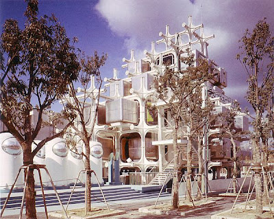
        This idea led to the construction of the Nakagin Capsule Tower, perhaps the most emblematic building of the Metabolist Movement. Kurokawa's project was a bit more ambitious than the one that was actually built, and consisted of two towers housing the capsules, that could be growing organically according to future needs, according to Metabolist principles. The buildings consisted of two components: a mega-structure of reinforced concrete containing the elevators, stairs as well as bridges that interconnect to other buildings, and the capsules, which would anchor the structure in just 4 points for easy replacement every 25 years.


        Ironically, these events marked the decline of Metabolism, as the energy crisis of the 70’s forced to rethink the role of urban growth and cities.

        INFLUENCES

        Metabolism had repercussions way far beyond Japan, in places like Peru, Macedonina and United States.
        Kiyonori Kikutake’s proposal for the Marine City in Hawaii, in 1963 was a series of  cylindrical buildings that accommodated housing units, which were attached to a fixed core. As the units became older, they were replaced by new ones, similar to regenerating cells. This was a much earlier version of Kurokawa’s Nakagin capsule tower.

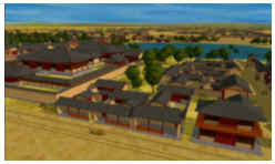
        Marine City, Hawaii. Kiyonori Kikutake, 1963. These "rollers" were cylindrical cores from which housing units were born. As the units became older, they were replaced by new ones, similar to regenerating cells.
        Photo courtesy of mr. Prudence .

        In 1967, Peruvian President architect Fernando Belaunde, promoted experimental housing systems called PREVI, to which Metabolists were invited, along with other famous international architects. The proposal of Kiyonori Kikutake, Kisho Kurokawa and Fumihiko Maki was characterized by a long and narrow layout of the dwelling units, that regulates the rigid division between the services and living functions.

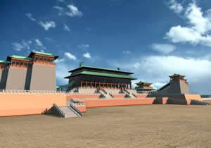
        Another example is the 1967 Master Plan for Skopje, carried out by Kenzo Tange. After a strong  earthquake that devastated the Macedonian capital, the UN organised a competition for an urban plan for the new city. A winner Tange envisioned a capital structured around two concepts: the "City Gate", which was the hub of entry into the capital, comprising all transportation systems, and the "City Wall", consisting of apartment buildings, simulating a medieval wall, which would incorporate housing to the downtown areas.


        Plan reconstruction of Skopje, Macedonia. Kenzo Tange, 1965. This proposal won an international competition and it was structured around two concepts: the "City Gate", which was the hub of entry into the capital, comprising all transportation systems, and the "City Wall", consisting of apartment buildings, simulating a medieval wall, which would incorporate housing to downtown

        THE EVENT
        On March 11 a huge earthquake hit Tohoku, northeastern Japan, whose intensity (9.0 on the Richter scale) was the highest in the country's history. Japan sits atop the Eurasian tectonic plate and is pushed by the Pacific plate and the Philippine plate. Every 30 years it is expected a 7 to 8 magnitude earthquake will occur in this area (Miyagi Jishin), due to the tension of the Philippine plate. What nobody expected, since it happens every 1000 years, is a 9 magnitude earthquake, resulting from the breakup of the Pacific plate (Miyagi Oki Jishin).
        Because the frequency of tsunamis in this area, given the intricate coastline profile that reverberates water waves , the coast is protected by dikes and barriers up to 4 m height. However, the strength of the earthquake made the whole coast to sink up to 1 m. Besides, nobody could expect the super wave of 7 m that surpassed the concrete defenses as if they not exist at all. Moreover, large blocks of those became a moving wall of mud and debris that collided with the wooden houses that were standing on the shore.


        THE ICON
        On May of the same year I was standing upon the site where once stood Minami Sanriku, a fishing village resort located in Miyagi Prefecture. As much as 95% of the village was destroyed and at least 60% of its population perished (10,000 people). The survivors lost everything.
        The tragic panorama  reminded me of the pictures of the atomic attack on Hiroshima. A thick haze wrapped a landscape of death and seemed  to still carry the heavy load of thousands of moans, cries and tears of so many people, making us breath the scent of the tragedy.
        One of the surviving structures was Disaster Prevention Center, although only its steel frame could be seen. After experiencing an earthquake for five long minutes, Miki Endo, a worker Disaster Welfare Service received a tsunami alert and began to broadcast alarm messages to the population. Many people looked for safe places, like the roofs of the few tall buildings in town. 40 minutes later, a big wave came to town, dragging everything in its path, and becoming a deadly wall of debris, cars and boats that reached a speed of 100 km per hour. The public servant heroically continued broadcasting without trying to seek refuge, managed to save many lives, until she was engulfed by water.
        The building became a symbol of her heroism and Japanese resilience facing catastrophic events.


        WHAT IS COMING?
        The huge scale of this disaster mobilized the whole country and a plethora of architectural proposals were developed throughout Japan. To the widely discussed ideas of Japanese masters and Pritzker awardees Toyo Ito and Shigeru Ban, many other ideas had been discussed in academic circles.
        Perhaps, like in the past, this is a new chance for the development of new urban and architectural ideas and theories.

         
        Toyo Ito presenting its ideas on House for All during the UIA World Congress of Architecture, Durban, South Africa. 

        SEE ALSO 
        - Kenzo Tange WORKS
        - Kisho Kurokawa WORKS
        * SPECIAL FEATURES


        Thank you very much to Charlotte Broadribb and Michelle Alderton from RIBA for inviting me to participate in this event and for sharing this screen grab. I hope some day I can replace it with a picture of us together.


        Viewing all 72 articles
        Browse latest View live